Author: simonc

PC CPUs: The Next Generation Is Here

Why it’s important: Back in the day, there were only two companies making CPUs. Now, there are twelve. Most of the new players focused on the big and profitable data center market. But now, some are also targeting PCs. Nvidia and AMD are getting ready to make Arm-based CPUs for PCs. Microsoft is allowing Arm laptop CPUs, which is not great news for Qualcomm right now and could be a problem for Intel in the distant future.

Even though Intel has had a tough time in the data center for the past five years, they’ve managed to keep a hold on the PC market. While PCs don’t bring in as much money as data center CPUs, they sell in large quantities and help keep Intel’s manufacturing plants busy and financially healthy.

Intel’s PC market share has been maintained for the most part because of two key factors: the Intel brand and something known as “channel control.” Most consumers aren’t concerned with or well-informed about semiconductor manufacturing methods or instruction set architectures. What they do recognize is the Intel brand, which has been built through extensive advertising efforts over several decades.

For most consumers, selecting a PC CPU can be a confusing task filled with complex technical specifications. This means that even if AMD’s latest CPU appears superior on paper compared to Intel’s, Intel can still maintain an edge. Furthermore, consumers don’t directly buy from Intel; they buy from popular PC brands like HP, Dell, Asus, Lenovo, and others. These companies have strong ties with Intel, partly because they receive significant marketing incentives from Intel, which contribute significantly to their PC profits. These PC brands are hesitant to distance themselves from Intel because they fear losing these subsidies.

The only recent entrant into the PC CPU market has been Qualcomm. Qualcomm has dedicated nearly a decade to establishing a presence with its Arm-based CPUs, which required extensive efforts, especially in adapting Windows to Arm architecture. This endeavor strained Qualcomm’s relationship with Microsoft. Nevertheless, Qualcomm now appears to offer a reasonably competitive CPU.

We’ve discussed Qualcomm’s efforts before, and the main point is that it’s unlikely Qualcomm will gain a significant share in the PC market anytime soon unless people suddenly value on-device AI support. While that doesn’t seem very likely, it’s worth noting that Qualcomm currently has one of the best AI cores (NPU) for laptops.

Qualcomm has received criticism for its long-standing PC investment. However, one advantage it had was its exclusive partnership with Microsoft. For years, Qualcomm was the sole company working with Microsoft to adapt Windows for Arm-based devices. This exclusivity has now changed with the recent Reuters report about Nvidia and AMD entering the Arm CPU market. Microsoft is now open to supporting CPUs from other vendors for Windows. Importantly, these new entrants have a stronger background in Windows than Qualcomm. Qualcomm has faced challenges in building a software ecosystem for Arm-Windows, and the new entrants will likely have an easier time due to Qualcomm’s previous work. Qualcomm may need to reevaluate its efforts in the PC market, which is already small and has become more competitive. This is not an ideal market for Qualcomm to excel in.

Nvidia and AMD’s Entry into the CPU Market: What Does It Mean?

Now, what should we think about Nvidia and AMD’s initiatives? AMD’s move is a bit puzzling. They already have a decent share in the PC laptop market, but it’s a distant second to Intel, despite Intel facing its fair share of challenges over the years. We suspect this might be AMD’s way of showing goodwill to their long-standing partner, Microsoft (something Qualcomm could learn from).
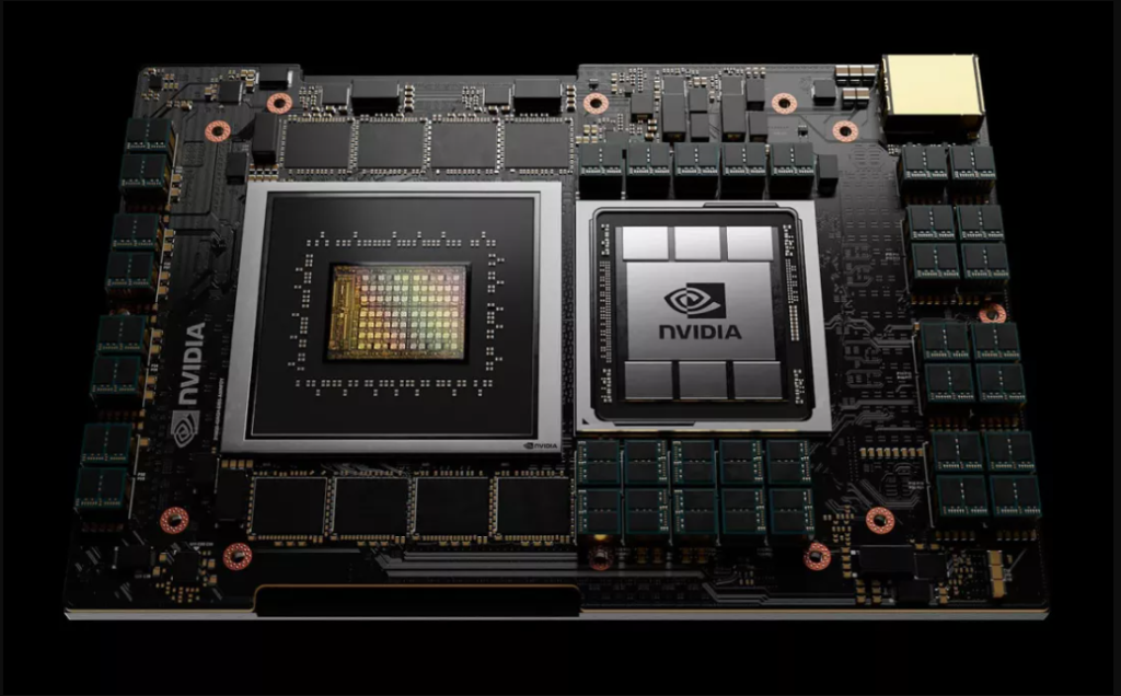
The real question is whether AMD will invest significant marketing resources to gain a share in this space, even if it means potentially eating into their existing market share. How will the average consumer react when faced with the choice between an AMD x86 laptop and an AMD Arm laptop? Confusion might be the likely outcome, and they might opt for the familiar Intel brand instead.

On the other hand, Nvidia has a more compelling case. They already have a strong consumer brand, mainly in gaming, which carries significant weight. They can also earn brownie points with Microsoft, a substantial customer and partner, and they don’t have a competing product to worry about. In fact, an Nvidia CPU/GPU combo laptop could create a new product category. Many gamers we know would probably rush to get one.

Apple’s Impact on the PC CPU Market: A Blind Spot for Semiconductors

Now, let’s delve into the real focus of this discussion: Apple. It’s quite surprising that semiconductor vendors often avoid mentioning Apple in conversations about PC CPUs. It’s a significant blind spot. We’ve even heard Intel executives claim that “we do not compete with Apple.”

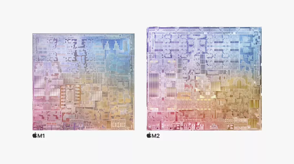
Over time, Apple has been steadily eroding PC market share, particularly when it comes to profitability. On average, a Windows PC sells for at least $500 less than the lowest-priced Mac. Apple dominates the lion’s share of profitability in personal computing, just as it does in the mobile phone industry. While we haven’t recently crunched the numbers, we’re fairly certain that the transition to Apple’s M1 CPU has widened this gap even further. This issue is so substantial for other laptop manufacturers that it’s almost easier to ignore.

Microsoft is well aware of this problem, and while its success isn’t solely dependent on the PC market, it remains a significant and strategically important segment for them, both in terms of profit and overall strategy. They recognize the need to address the lack of PC profitability, and they appear to see the CPU as a crucial element of their strategy. There’s some logic to this, as M-powered MacBooks are known for their power efficiency compared to Windows laptops. However, we’ve encountered many players in the Windows supply chain who seem to idealize Arm CPUs, believing that having Arm CPUs would help them compete better with Apple. We think this perspective misses the mark. Apple’s success lies in its ability to integrate its software with its silicon tightly, and the Arm component is not the sole differentiator.

Nevertheless, the new Windows CPUs could inject some vitality into the market. Arm-based chips thrived in mobile largely due to the intense competition among semiconductor vendors. Arm consistently emphasizes its mobile ecosystem, which, in part, resulted from numerous companies competing in the space. This competitive environment drove faster innovation and progress.

Potential for a New Era of Innovation in Windows Laptops

This scenario could potentially materialize in the laptop market, especially if Nvidia and AMD are just the initial players. A thriving ecosystem of Arm-based Windows CPUs has the potential to ignite a fresh wave of innovation in Windows laptops, leading to more specialized offerings. Nvidia might focus on the high-end segment with premium gaming laptops, while AMD and Qualcomm can carve out their unique niches. Some players may opt for a budget-friendly approach, posing a competitive challenge to Google Chromebooks.
It’s too early to determine if this scenario will become a reality, but the possibility now exists. Currently, we believe Intel is relatively shielded from immediate threats, particularly as it introduces enhanced products with improved manufacturing. However, looking further ahead, if robust competition emerges from Arm CPU manufacturers, Intel could indeed face significant challenges.


About the Author: simonc

Don’t Just Throw Away Your Old Gadgets! Here’s What to Do With Them

If you’ve recently upgraded to a new phone, laptop, tablet, or something similar, you probably want to put your old device to good use. Instead of simply disposing of it in the trash, consider giving it to a friend or family member, donating it, or recycling it. However, there are some important steps you should take before parting with it.

Your top priority is safeguarding your privacy. You need to ensure that all of your personal data is completely removed from the device before it’s passed on to another user. There are standard methods for accomplishing this, such as performing a full reset and more advanced steps if you have concerns about someone with potentially malicious intentions seeking out used devices.

Older devices, especially their batteries, may raise safety concerns, but recycling services typically handle this aspect. Assuming your gadget is in working condition, once you’ve safeguarded your data and removed any additional components, it’s ready to find a new home.

Backup and Delete Your Data

No matter what type of device you’re passing on – be it a phone, tablet, laptop, game console, or most modern electronics – it’s crucial to ensure that your personal data is removed first. This isn’t just about privacy; it’s also a security concern. Even seemingly innocuous information like your name and phone number can be exploited by identity thieves to launch targeted attacks.

Thankfully, nearly all these devices offer a reset option, which wipes out all your personal data, along with stored files and applications. It might take a few minutes, but it’s a dependable and straightforward process.

Start by backing up any essential data. For phones or tablets, this is straightforward, as most data is already synchronized with your Apple, Google, or Amazon account. Ensure that photos, videos, music, and text messages are backed up. Computers can be more intricate, as you might need to transfer a significant amount, or even all, of the data from the storage drive.

If you’re looking for a more secure method to erase files and personal information permanently, you should overwrite the storage on your device. This ensures that the data cannot be recovered using various advanced tools. Several methods can achieve this, but the primary platforms to focus on are Windows and macOS.

Harvest (Or Destroy) Parts

Before parting with your device, remove detachable components, such as SIM cards, MicroSD cards (for phones), CDs, DVDs, camera cards, and USB peripherals (for laptops and desktops). When dealing with game consoles, check for game discs, cartridges, and storage cards.

For computers, consider the more secure option of extracting the storage drive, though be aware this will render the device non-functional if you plan to sell or donate it. This action significantly reduces the risk of data recovery.

While taking out the storage drive from a desktop is generally straightforward, it may be more challenging for compact models like the Mac Mini or iMac. Extracting the industry from a laptop can be intricate, especially in newer ultra-thin models with soldered storage. Online research can help determine your capability for this task.

In some instances, you might be able to salvage other removable components, such as graphics cards from gaming desktops. However, if you’re getting ready to sell or recycle a computer, there might not be much worth salvaging for a new system. If you pass the computer to another user through donation or as a gift, ensure it remains functional. For those interested in specific parts or capable of repairs, you can consider parting with those components.

Cleaning Up

When passing on your device to a new user or donating it, it’s considerate to ensure it’s in optimal condition. You’ve addressed the software aspect, now let’s focus on the hardware.

A bit of dusting and potentially cleaning out any accumulated dirt in crevices with isopropyl alcohol can be beneficial. If your device is exceptionally dirty or sticky, using a toothbrush (being cautious not to introduce moisture into sensitive ports) might be necessary. Keyboards and mice, due to frequent handling, may require a more thorough cleaning and disinfection process.

Where to Donate and Recycle

Ready to declutter and part with some belongings? There are various avenues for donating items, and several electronics stores, such as Best Buy, offer free electronics recycling services. Additionally, your local municipal waste or recycling service might provide free electronics recycling and contribute the e-waste to industrial recycling companies.

If your gadget is in working order, consider donating it to organizations that distribute electronics to individuals in need. There are numerous such organizations, often found in your vicinity: schools, religious institutions, homeless and welfare programs, senior centers, and retirement homes, to name a few. Tablets and laptops are frequently in demand.

If you’re unsure whether a particular place accepts your item, a simple phone call can clarify. In case they can’t use it, they’ll likely guide you to an appropriate alternative. If all else fails, organizations like the Red Cross, Goodwill, and the Salvation Army often accept functional items produced within the last decade.

For those inclined to donate to non-religious organizations, options may be more limited. A search for charities seeking donations in your nearest major city can yield potential choices. Urgent donation needs are often advertised in local newspapers or shared on social platforms like Facebook and Nextdoor.

Remember that you can always ask your friends or family if they have any use for the items you’re looking to part with. Even if they don’t, they might know someone who does.

About the Author: simonc

8 Creative Ways to Use Your Old PC, Even If It Can’t Run Windows 11

Starting in October 2025, standard versions of Windows 10 won’t receive security updates. But if your computer doesn’t meet Windows 11’s stringent hardware requirements, you don’t have to discard it just yet! There are numerous excellent ways to repurpose your computer.

Install Linux Instead

Linux offers numerous distributions (distros) that can effectively replace Windows for the majority of users. These distros support all the essential productivity software, and for many tasks, a web browser is all you need.

Even if you’re a gamer, there’s no need to make a complete transition, as gaming on Linux is continually improving. Moreover, there are user-friendly Linux distros available, and in many cases, you can try them out without removing Windows.

Use It as a NAS

While cloud storage is convenient, it’s dependent on a working internet connection, constrained by your internet speed, and raises privacy issues. So, why not repurpose your old computer into a NAS (Network Attached Storage) server?

Simply install a few affordable hard drives, set up your preferred NAS operating system and software, and enable users to save and retrieve data over your high-speed local network.

Make a Streaming Server

This idea is closely related to transforming your computer into a NAS. Still, it includes the extra feature of streaming video content from your personal video collection to anyone within your network (or even outside it, depending on how you configure it).

You can opt for a commercial solution like creating a Plex server, or you can convert your computer into a DLNA media server.

Host Your Own E-book Library

If you have a library of e-books, comic books, or any other documents, you can utilize software like Calibre to manage and deliver them to your devices, such as tablets or e-readers.

Make a Dedicated Gaming Server

If you have a favorite multiplayer game that’s facing a shortage of servers, consider repurposing your old computer to host a dedicated server for that game. The compatibility of running a dedicated server on a non-Windows operating system will vary depending on the game. However, this can be an excellent solution to establish a fast and private game server for you and your friends.

Create Your Own Web Server

While creating and hosting a website typically involves paying for server space from a hosting service, you have the option to transform your computer into a web host, granting you full control over your website. Nevertheless, it’s important to note that not all home internet connections allow you to host a web server, as some ISPs explicitly prohibit it.

If your ISP permits web hosting on your home connection, it can be an interesting method to manage a small online forum or blog. This approach is ideal for those looking to start a site as a hobby and gain a deep understanding of the intricacies involved in the process.

Make a Hackintosh

Some believe that the era of Hackintosh computers is drawing to a close, but there are those who contend that Hackintoshes still offer value. Suppose your old computer possesses a motherboard, CPU, and GPU that are compatible with Hackintosh setups. In that case, it can be a fantastic way to prolong its usability, provided it can run a macOS version that continues to receive security updates.

Build an Arcade Cabinet

You might have come across projects in which individuals use small, affordable computers like a Raspberry Pi to create their own arcade emulation cabinets, which is just one of the many fantastic Raspberry Pi projects. Given that your Windows 10 computer is likely much more powerful than a Raspberry Pi, it can serve as the core of an arcade cabinet. As you already possess the PC component, it should be a more cost-effective solution than purchasing a pre-assembled system. You can readily purchase arcade cabinet kits from websites such as Amazon.

About the Author: simonc

How to Turn Off Your Keyboard in Windows With a Keyboard Shortcut

If you have a pet or a small child, you’re probably familiar with the chaos that can ensue when they get their hands on an unattended keyboard, resulting in a string of random characters. Fortunately, we have a handy tool that allows you to lock and unlock your keyboard using a simple keyboard shortcut.

Keyboard Locker is a lightweight program that performs this task efficiently while using minimal system resources. It originally started as a small AutoHotKey script created by a forum member known as Lexikos. We’ve enhanced and compiled it, eliminating the need for AutoHotKey installation. However, if you do have AutoHotKey installed, we’ve included the original script in the download, allowing you to customize it to your preferences.

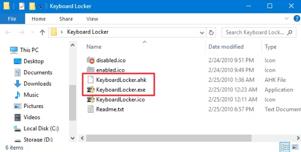
To begin, download Keyboard Locker and unzip the folder to your preferred location on your hard drive. Inside the Keyboard Locker folder, you’ll find various files, including icons and a readme. The two key files you’ll need are “KeyboardLocker.exe” and “KeyboardLocker.ahk.”

If you haven’t installed AutoHotKey, simply double-click the “KeyboardLocker.exe” file to run it. This file is an AutoHotKey script that has been compiled to function as a standalone program, eliminating the need for AutoHotKey installation.

For those who are already familiar with AutoHotKey, you can opt to use the “KeyboardLocker.ahk” file to run the script directly. The advantage of using the script version is that it allows you to customize the keyboard shortcuts for locking and unlocking as per your preferences.

Once you’ve launched Keyboard Locker, a small keyboard icon will appear in your notification area, indicating that the tool is ready for use.

To lock your keyboard, simply press the Ctrl+Alt+L keys simultaneously. You’ll notice a change in the Keyboard Locker icon, indicating that the keyboard is now locked.

Most keyboard inputs are disabled when locked, including function keys, Caps Lock, Num Lock, and various special keys found on media keyboards. Some key combinations like Ctrl+Alt+Delete and Win+L can still function, but they are highly unlikely to be triggered accidentally by a pet or a child.

To re-enable keyboard input, you can easily type the word “unlock.” As you do this, the Keyboard icon will revert to its normal appearance, indicating that the keyboard is now unlocked.

How to Show Balloon Notification Reminders

By default, Keyboard Locker does not show notifications when you lock or unlock your keyboard. If you wish to enable notifications, simply right-click the Keyboard Locker icon in the notification area and then select “Show Tray Notifications.”

Keyboard Locker will now show notifications when you lock or unlock your keyboard.

If you’d rather not receive notifications, you can also view the shortcuts for locking and unlocking your keyboard by hovering your mouse over the Keyboard Locker icon.

How to Start Keyboard Locker when Windows Starts

Running Keyboard Locker when you need it is straightforward, but you can also set it to launch automatically when Windows starts by placing it in the Windows startup folder. For detailed instructions, you can check out our guide on adding programs, files, and folders to system startup in Windows.

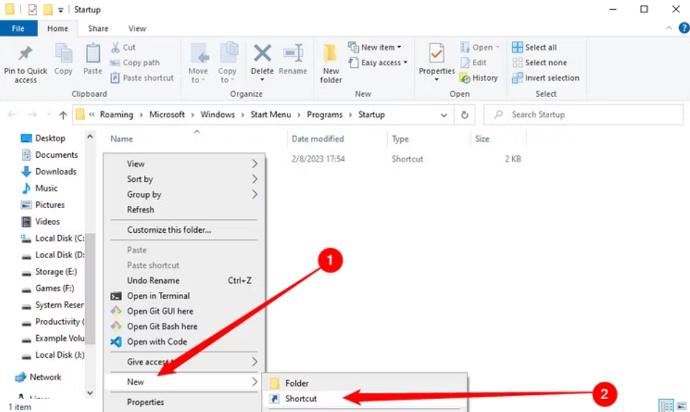
In brief, you can place your AutoHotKey folder in any location you prefer. To open the Run dialog, press Windows+R, then type “shell: startup” in the “Open” box, and click “OK.”

To ensure the Keyboard Locker runs automatically when Windows starts, create a shortcut to the “KeyboardLocker.exe” or “KeyboardLocker.ahk” file (whichever you use) in the Windows startup folder. You can do this by right-clicking the file and dragging it to the startup folder, then selecting “Create shortcut here” with your right mouse button. Alternatively, you can right-click within the startup folder, go to “New,” and choose “Shortcut” from the context menu. Once the shortcut is in the startup folder, the Keyboard Locker will launch automatically when you start Windows.

If you enjoy some company while working on your computer, having a child or pet around can be delightful. However, it can become quite disruptive if they start mashing the keyboard. Keyboard Locker is a handy tool for those with curious pets and inquisitive infants.

About the Author: simonc

11 Best Fonts for Web Design in 2023

Picking the right fonts is crucial for any project, whether you want a classic look or something more artistic. Knowing which fonts work best for a great design is hard with so many choices.

To find some of the top fonts for web design, we looked at the fonts Webflow users have been using for the past few years. We found 11 fonts that consistently ranked high in popularity year after year.

Roboto (+ Condensed and Slab)

Roboto is a very popular font among web designers. It includes basic Roboto, as well as Condensed and Slab variations, and Webflow users have been using these fonts a lot in recent years.

The Roboto font family offers a lot of different styles and sizes, making it a versatile choice for web design. The condensed versions save space, while the slab versions provide a serif option that goes well with the classic Roboto.

Roboto also supports many different writing systems, including Latin Extended (for European languages), Cyrillic (Russian/Bulgarian/Ukrainian, etc.), Greek, Hebrew, and more. This makes it great for websites in different languages.

Libre Franklin

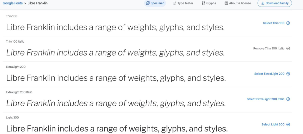
Libre Franklin is a modern and flexible web font that brings classic American typeface style to the internet. It’s a popular choice for websites that use different languages because it works well with Latin-based languages as well as non-Latin languages like Greek, Cyrillic, and Arabic.

This font has special features built into it, like small caps, ligatures, fractions formatters, and other stylistic options, which help it stay sharp and clear no matter the screen size or zoom level. With over 700 different characters and three weights, designers have a lot of choices for how they want to use this font in their designs.

Raleway

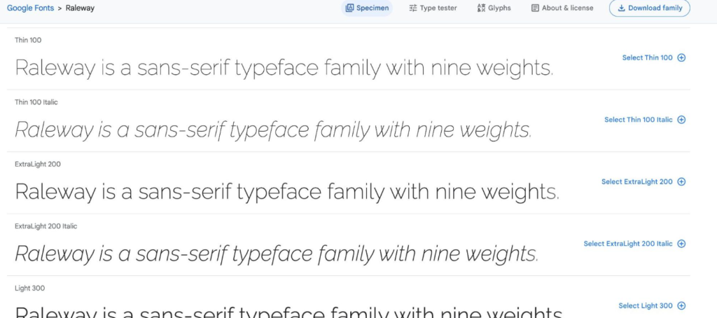
Raleway is a sans-serif font with clear, open letters that are easy to read on screens. It comes in various styles, including different weights, widths, and extra design options like swirly letters, ligatures, fractions, and more. Designers have plenty of choices when using this classic font.

Both Windows and Mac computers can use Raleway. It’s also on Google Fonts, which is great for web designers because it’s free and easy to use without worrying about licenses or downloads. In Webflow, you can easily add Google Fonts to your project.

Inter

Inter was made for screens and user interfaces. It’s a variable font, so it’s great for designs that need to fit various screen sizes and resolutions, making sure your content looks good on all devices, even small screens.

Inter has different design options that let designers add special touches to their text. It’s also open-source, so designers can customize it to fit their own style.

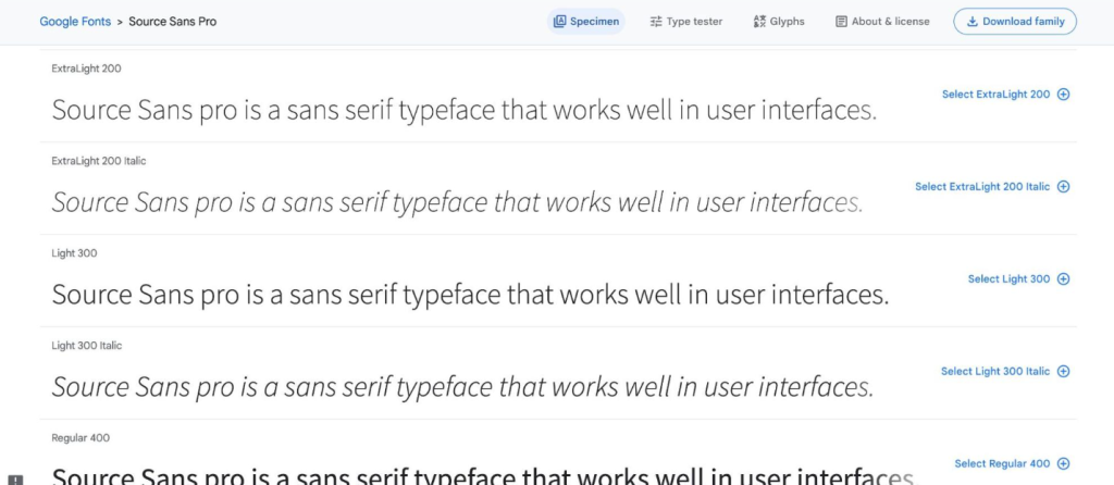
Source Sans Pro

Source Sans Pro is one of the best web fonts because it was made to be super easy to read on the internet. Its simple letters, and extra space between them make it great for reading online. It also works well on websites with lots of things going on.

Source Sans Pro can be used for websites in over 200 languages, including Cyrillic, Greek, and Vietnamese. This makes it perfect for websites that need to be in many languages. Plus, it looks good even on screens that aren’t very clear because of the special technology used to make it look sharp.

Poppins

Poppins is a font that can work with Latin letters and also the Devanagari writing system used in languages like Hindi and Sanskrit. It’s a good choice if you need a font that can be used internationally.

Poppins is designed to look good, whether you use it in small text or big headings on websites and mobile devices. It’s great for web and user interface (UI) designs that need to look stylish, clear, and easy to read.

Poppins also has some special features that let designers customize text. For example, ligatures help combine characters in a more interesting way without making the text hard to read or causing problems with different web browsers and devices.

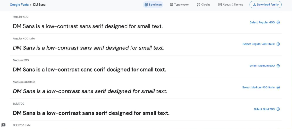
DM Sans

DM Sans has a clean and modern style that’s great for simple designs. It’s a sans serif font, which means it doesn’t have the little decorative lines at the ends of the letters. It has a rounded shape with curved corners, giving it a friendly yet professional look.

DM Sans is often used for the main text on websites because it was made to look good in small sizes.

It works well for English and other Western European languages. DM Sans has five different styles to choose from, and it also has extra features like fractions, ordinals, superscripts, subscripts, case-sensitive forms, and different number styles. These features make it very versatile for different design needs.

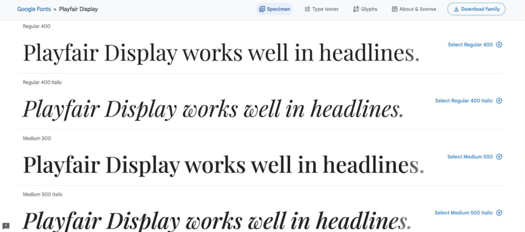
Playfair Display

Playfair Display is a bold, stylish font often used for headlines and titles. It has slightly narrower letters and a modern look, making it suitable for both big and small text.

It’s good for English and other Western European languages. With five different styles and special features like fractions, ordinals, superscripts, subscripts, and various number styles, it’s quite versatile for different design needs.

FA (solid 900, brands 400, 400)

FA (Font Awesome) Solid 900, FA Brand 400, and FA 400 aren’t exactly fonts. They’re different versions of an icon library used in web design. Font Awesome provides a variety of customizable icons for websites, and they are very popular in UI and web design.

FA Solid 900 is bold and high-contrast, perfect for headers. FA Brand 400 has less contrast but offers features like color, animation, and resizing. FA 400 combines quality and complexity, making it suitable for larger interfaces or detailed small icons while keeping them clear.

Rubik

Rubik, inspired by the Rubik’s cube, is a geometric sans serif font you can find on Google Fonts.

It’s perfect for headlines and titles on websites, especially when paired with a classic serif font for the main text. Rubik offers nine different weights and many OpenType features, making it a good choice for designers who want a clear font with room for creativity.

It works with Latin-based alphabets and supports Cyrillic scripts used in languages like Russian or Bulgarian.

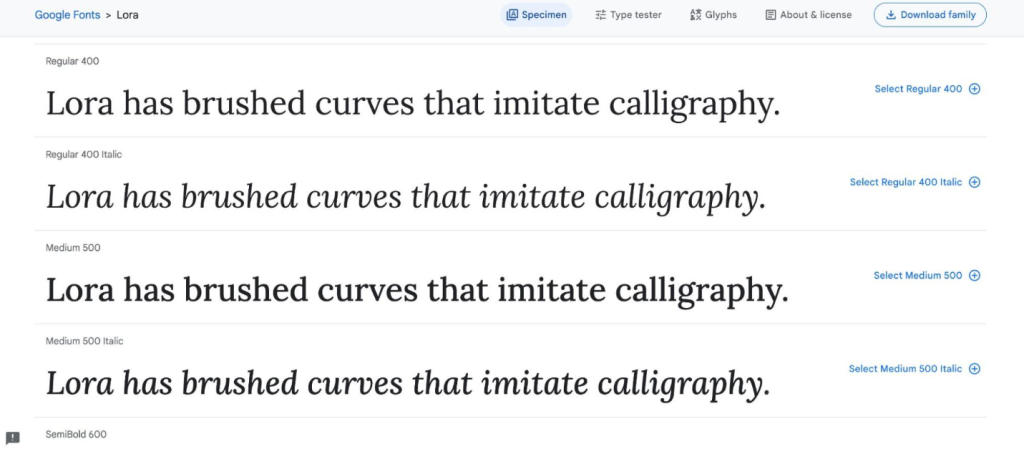
Lora

Lora is a stylish and contemporary font that combines traditional serif letters with modern sans-serif elements, resulting in a beautiful look for your design work. Its slightly condensed letters make it great for highlighting headings and important visuals while still being easy to read.

Lora offers various widths and weights, and it has many ligatures that let the letters flow smoothly, ensuring readability at different sizes and in various contexts.

About the Author: simonc

The Basics of Color Theory for Designers

Color theory is a set of rules and ideas about how to mix colors and create beautiful combinations. If you’re a designer, learning the basics of color theory can help you make attractive color schemes for things like graphic design and web design.

Color theory is a blend of science, psychology, and feelings, which makes color an important part of design. It all began with Sir Isaac Newton’s color wheel, showing how light produces a range of colors. Color theory has grown over time, revealing the science behind why some colors look good together.

Color psychology also plays a role. Factors like culture, history, and emotions affect how people react to colors. When you understand color theory, you can use science and psychology to make your audience feel certain emotions and react in specific ways to your design.

Before we get into the theory, let’s go over these key terms:

Primary colors

The primary colors are the foundation of all other colors. We perceive three main colors: magenta, cyan, and yellow (CMY). Every color we see is made by mixing these three colors in different ways – changing the amounts, brightness, tints, and shades.

Traditionally, we thought of red, blue, and yellow as the primary colors. However, research has shown that magenta, cyan, and yellow better describe how we see colors. You’re not alone if you associate these colors with printer issues due to a lack of magenta ink. The CMYK color model – cyan, magenta, yellow, and key (black) – is used in color printing. It’s called subtractive because it removes red, green, and blue from white light.

RGB and hex

On the web, we use RGB and hex values to represent colors. RGB is an additive color model that creates colors by adding colored light to black.

RGB defines colors using three values: red, green, and blue. For example:

  • rgb(59, 89, 145) equals Facebook blue
  • rgb(0, 0, 0) equals black
  • rgb(255, 255, 255) equals white

Hex values convert these to a base-16 representation, like:

  • #3b599b equals Facebook blue
  • #000000 equals black
  • #ffffff equals white

Each pair of characters represents a color value, e.g., 3b for red, 59 for green, and 9b for blue in Facebook blue.

Hot and cold

Colors can feel warm or cool. Warm colors have more reds and yellows, making a design feel warm and passionate. They can also be bold or aggressive, like red in error messages. Cool colors have more blue and can remind you of cold things like ice or water. They can also feel lonely or sad, but they can be soothing too, like a blue sky or calm blue waters at the beach.

Color temperature

Making an image warmer means adding more orange tones, which can make it look happier, like a sunny day. On the other hand, creating an image cooler adds blue tones and makes it seem colder and less inviting, like a cloudy day.

Tints and shades

To make a color lighter, you add white; to make it darker, you add black. Tints and shades help you create color schemes by mixing white and black with a base color. For instance, if your base color is a light blue, like #8dbdd8, you can create a color scheme by selecting two lighter blues (tints) and two darker blues (shades).

Saturation, hue, and lightness

Saturation tells you how intense a color is. More saturation means it’s richer and darker, less saturation makes it lighter and faded. When we say “light blue” or “dark green,” we’re talking about saturation. Hue is how much a color resembles red, orange, yellow, green, blue, indigo, and violet (the colors of the rainbow). When you say “blue-green,” you’re talking about two hues. Lightness, or value, is about how bright a color looks compared to pure white.

The color wheel

The color wheel has 12 main colors, and each slice shows different shades, hues, tints, and mixes. For instance, you can get colors like yellow-orange or red-orange by mixing yellow and orange. The primary colors are red, yellow, and blue. The secondary ones are violet, orange, and green. Everything else is a tertiary color, made by mixing primary and secondary colors. Designs use the color wheel for five types of color schemes.

5 types of color schemes

Designers make color schemes by combining different color families from the color wheel. This works best when using specific patterns that create color harmony.

Monochrome

A monochromatic color scheme includes different variations of a single base color with various tints, shades, and saturations. These schemes are very unified but can become repetitive.

Complementary

Complementary color schemes use two colors that are opposite each other on the color wheel. This creates a strong and eye-catching contrast due to the significant difference between the two hues. Split complementary schemes involve one primary color paired with two colors that are adjacent to its complement.

Analogous

Analogous color schemes include three colors that are adjacent to each other on the color wheel. These schemes offer a harmonious and unified look due to their similar tones, avoiding the potential monotony of a monochromatic scheme.

Triadic

To create a triadic color scheme, imagine an equilateral triangle on the color wheel and choose the three colors at its points. This triad results in a balanced and diverse color scheme.

Tetradic

A tetradic color scheme involves four colors evenly spaced on the color wheel. These four colors can create either a square or a rectangle, so some references categorize them as square or rectangular color schemes.

Use color theory in your designs.

In your designs, remember that color is a powerful tool for evoking emotions and establishing brand identity. Think about how some brands are easily recognizable just by their colors, like Coca-Cola’s red or Starbucks’ green. Color can be so closely associated with a brand that it becomes a legal trademark, as seen with T-Mobile’s magenta.

Whether you’re choosing complementary colors for a logo or creating a complete web design color palette, applying the basics of color theory will enhance the visual impact of your designs. Use your newfound knowledge of color to add zest to your creations.

For additional color resources, visit Webflow University, where you’ll find tutorials for beginners and advanced designers. These tutorials cover topics like color values, color contrast, and more.

About the Author: simonc

17 UI/UX Design Tools for the Modern Designer in 2023

UI design tools help designers create detailed wireframes, mockups, and prototypes to build functional products. They deal with the specifics of a design, focusing on its functionality.

On the other hand, UX design tools concentrate on the user’s experience with the content. They assist in structuring how users interact with information and the overall experience. These tools help designers plan how content and organization will impact the user’s journey.

Now, let’s explore some UI and UX tools that can be useful in your design process. While some tools have features for both UI and UX, we’ve categorized them to make it easier for you to find what you need.

Sketch

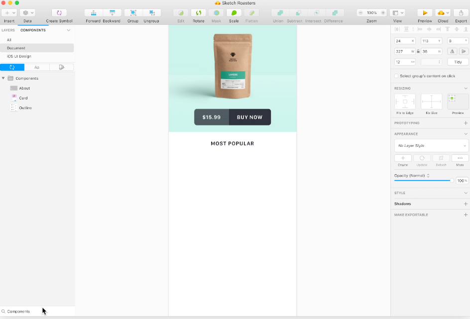
If you’ve worked on UI design, you probably know about Sketch. Many designers love it for good reasons. Sketch offers features like a library of symbols, layer styles, and text styles. It’s easy to make changes across your design, saving you time and ensuring consistency. It also has tools for resizing and aligning elements smoothly. Moreover, Sketch supports many third-party plugins, so you can expand its functionality with various helpful tools. It’s a go-to choice for designers.

InVision Studio

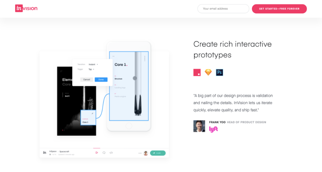
InVision is a powerful tool for UI design. It offers a bunch of applications to help designers create prototypes with interactive elements and animations. But it’s not just for designing. InVision also helps with teamwork. It has features for collaboration, allowing developers to share their work while they’re designing, get feedback, and make documented changes. There’s also a digital whiteboard for brainstorming and collaboration, which helps teams share ideas and get approval before moving on.
Axure

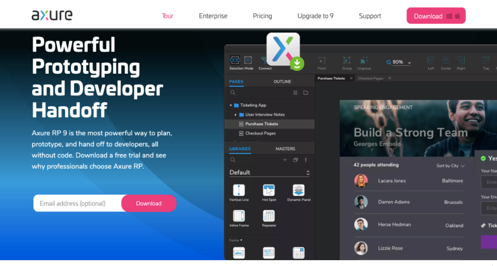
Axure is a tool for prototyping and keeping your project organized. It has a user-friendly interface that lets you document your work as you go. It’s all about creating detailed prototypes. Axure has many of the features you’d find in other popular prototyping and UI design tools. You can test how things work, and it helps with the handoff to developers. It also puts a lot of emphasis on communication, which means everyone on the project can stay updated in real time. All of this makes Axure a great choice for UI design.

Craft

Craft, an InVision plugin, syncs seamlessly with Photoshop or Sketch, saving you time on updates. It’s not just about prototyping and collaboration; it ensures everyone works with the same project version by syncing style changes and edits. Craft stands out with its placeholder content, offering access to Getty and iStock photos for better visuals in your layout. You can also use your data or import it from other sources, making your mockups more meaningful and realistic, unlike many other UI design tools. This feature gives your mockups a truer final design look.

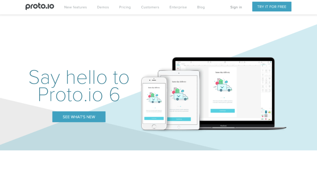
Proto.io

Proto.io claims to create “Prototypes that feel real,” and they indeed deliver. It provides the tools for designing, organizing, integrating, and testing lifelike mockups. It also streamlines collaboration, promoting team communication through comments and video feedback. Proto.io easily integrates with popular testing products such as Lookback, Userlytics, and Validately.

Adobe XD

Adobe XD, part of the Adobe Creative Cloud, is a top choice for UI designers due to its familiarity, vector-based UI tools, and real-time collaboration. It offers a full suite of tools for designing interactions and dynamic elements for prototypes and mockups, seamlessly integrating different design disciplines.

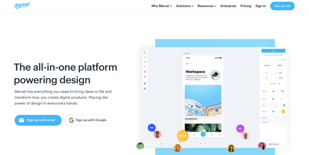
Marvel

Marvel’s design platform is a user-friendly tool suitable for both experienced and novice UI designers. It offers the versatility to create wireframes and interactive prototypes and conduct user testing, all within an intuitive interface. Moreover, Marvel simplifies collaboration with its Handoff feature, which provides developers with HTML code and CSS styles for seamless project development.

Figma

Figma empowers designers to create interactive prototypes and mockups, conduct usability tests, and seamlessly synchronize their work. This collaborative platform operates similarly to Google Docs, allowing multiple users to collaborate in real time. It provides visibility into who is currently working on the project and their activities. Figma’s browser-based interface ensures instant accessibility for all users. As an extra perk, it offers free individual access for users to explore and become acquainted with its features.

Framer X

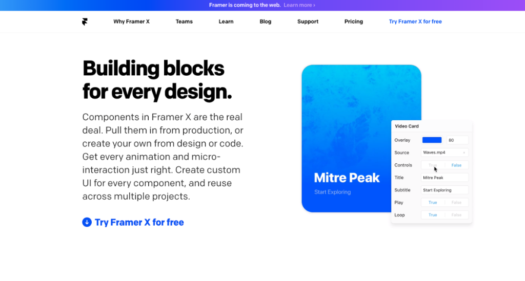
Framer X, initially a code-only prototyping app, now provides UI design tools for functional prototypes and usability testing. It’s perfect for UI designers who prefer staying updated on web design trends and offers various plugins from their store for added functionality. With an intuitive interface, Framer X is user-friendly.

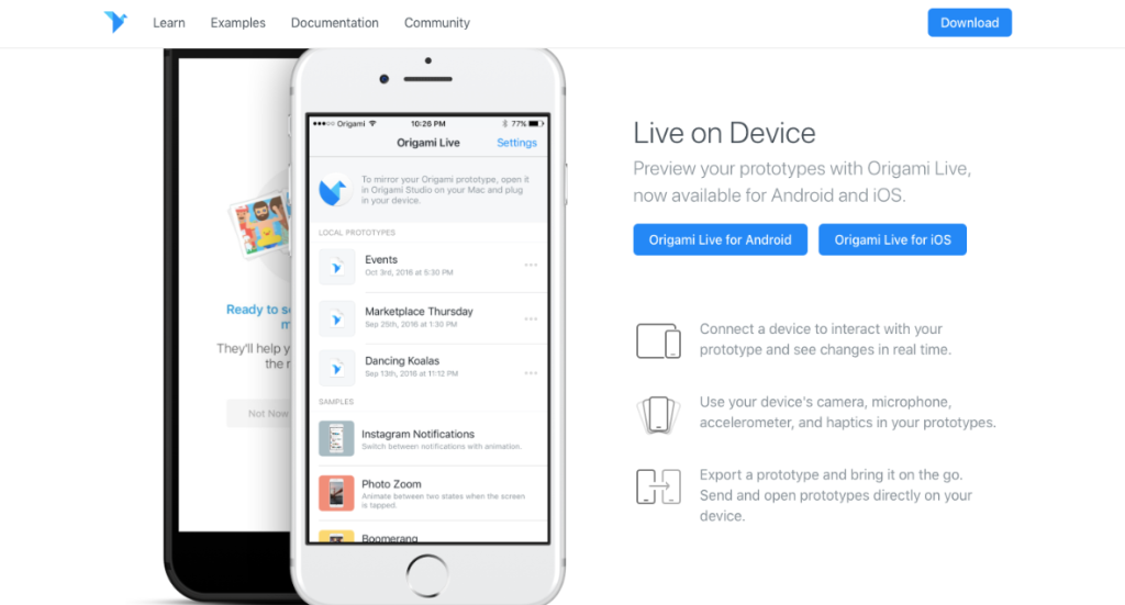
Origami Studio

Origami Studio, created by Facebook designers, is a robust prototyping tool ideal for more advanced users in the design field. It offers complex features, including a powerful patch editor, to create sophisticated prototypes resembling real apps or web pages. It also seamlessly integrates with Sketch for streamlined workflow.

About the Author: simonc

Web Form Design Mistakes to Avoid

Web forms. They’re central to product design (as many products essentially consist of forms from the user’s perspective) and typically the most crucial component of any web page they feature on. Given their significance, you might assume that after 25 years of crafting them, we would have perfected forms.

However, that’s not entirely the case.

Well, we do have a fairly good grasp of forms, but the knowledge seems to be somewhat unevenly distributed. Let’s examine some of the prevalent issues associated with web forms and explore ways to enhance them.

Label all the things in the field

You know what’s great? Field labels that stay visible even when I click into the field. I appreciate having a reminder of what the field is asking me.

But, like many brilliant ideas, this one falls short in practice. It creates problems for people with cognitive impairments and for the rest of us. When we fill out forms, we’re usually on autopilot. We don’t pay close attention to each field’s label and what we’re typing into it.

So, having the label in sight to remind me what I’m doing is super useful. It helps me work faster and ensures I don’t have to delete or cut entries I’ve already made just to double-check if they’re right.

This doesn’t mean you have to stick to standard form design practices. If you want to magically move the label out of the field and position it above when I click inside, go ahead.
But personally, I don’t mind either way.

Why Can’t We Use Social Media to Sign In?

I mean, who wouldn’t want the convenience of signing in with just one click, right? Well, maybe not so fast. I have to admit, it does seem a bit reckless to hand over our social media info to every app that asks for it. After all, social networks can disappear pretty quickly. Just look at Vine!

But let’s be real, it’s also incredibly satisfying. Social logins feel like a magic key to the entire internet. It’s as simple as allowing the app access, and voila! I’m in. So much better than filling out endless forms.

Sure, there are plenty of reasons not to use social login, so I won’t push too hard on this one. But it’s something to consider, and if you decide to use it, here are a couple of key points:
  1. Give me the option to sign in with my email, just in case I’m not keen on handing over my social data.
  2. Be clear about what you will and won’t do with access to my social accounts, especially when it comes to posting without my permission.

Totally use terms like “invalid” in error messages

Sure, feel free to decide what’s valid. You’ve definitely done extensive research on the special characters people actually use in their names, right?

I recently discussed the use of terms like “invalid” in error messages, so I won’t dive into it too deeply here. However, when crafting error messages, it’s crucial to be informative and supportive. Labeling an entry as “invalid” can be not only potentially offensive but also unhelpful because it doesn’t clarify what a “valid” entry should look like. So, please, just tell me your requirements clearly.

Calling an entry “invalid” isn’t just unhelpful; it could also be offensive because it doesn’t clarify what a “valid” entry should be.

Sure, request my “username.”

Because I absolutely want another thing to keep track of, in addition to all the emails and passwords for the other 120 websites I’m registered on.

Are we stuck in the 90s or what?

Here’s a revelation: the idea of an anonymous internet has been studied and found to be not very important. So, unless your website specifically requires a barrier between my online persona and my real identity, please do away with this unnecessary complexity. It only increases the mental effort and makes me more likely to click the “help me log in” button.

Of course, there are websites where anonymity (or the exciting possibility of it) is indeed a key part of the offering. Keep doing your thing. Additionally, I can understand the security rationale behind requesting a username, as it adds another layer of defense against potential hackers.

However, for the majority of websites and forms, it’s an unnecessary inconvenience. Even for those sites that genuinely require it, a brief explanation like:

“Creating a username helps keep your account more secure, as it’s harder to discover than an email address.”

Could greatly help alleviate my perception that you’re needlessly complicating my life. Remember: your customers aren’t aware of your processes or the reasons behind them. So, what’s the harm in sharing this information with them?

Don’t let me see what I’m typing

I understand the security concern. The bullets are there to prevent anyone from seeing the characters I’m typing, a basic security measure.

However, could you provide me with the option to take the risk? I’m in a secure environment, sitting comfortably in my office chair, with no one looking over my shoulder. Can I have the choice to reveal the characters?

Improving our web forms

Looking at all my complaints about form experiences, one thing becomes very clear: great forms require clear communication.

For example, keeping labels visible and not making them disappear when I click: that’s clear communication. Avoiding terms like “invalid”? That’s right, it’s about communication. Providing me with important information before I make a mistake? You got it.

Communication also plays a role in the security issues I’ve pointed out. Without knowing that these measures are in place to protect me, they just seem needlessly annoying. But if these websites took a moment to explain their purpose to me… well, that could greatly improve my relationship with the brand, couldn’t it?

Of course, the other important factor is making things easier for me, reducing the mental effort by allowing me to sign in with a social network, offering helpful error messages, and so on. So, be sure to look for ways to simplify your forms, including asking only for necessary information.

About the Author: simonc

11 Must-Have Sections for Your Web Design Contract

You’re likely aware that contracts are crucial in web design projects, but do you understand what should be in your legal agreement? We’ve got you covered.

Simply put, a contract is a deal between you (the designer) and your client. You both come to an agreement on the contract terms, covering things like what you’ll create, how much it’ll cost, when you’ll complete it, and how you’ll deliver it. What’s especially important is that the contract also addresses what happens in case things don’t go as planned, provides explanations for various “what-if” situations, and sets out the rules for breaches of the contract.

Why You Should Consider Hiring a Lawyer

Hiring an attorney is valuable for understanding legal language, drafting a customized contract, and avoiding common contract pitfalls. Ensure your lawyer focuses on the breach of contract clause, protecting you from nonpayment and late payments. Have an attorney review your template contracts for accuracy. Be cautious not to copy-paste content from one contract to another, as it can lead to embarrassing mix-ups.

The parties involved

Contracts commonly start by introducing the client and the service provider as the parties involved. This introduction includes their names, complete addresses, phone numbers, and email addresses.

Scope of work

Define the scope of work, which means specifying what must be done. This safeguards you from extra tasks, not within the project’s scope, should the client request them. It also ensures that the client isn’t charged for work they didn’t agree to.

The scope of work should clearly outline all the services you will provide. For instance, if you’re planning to conduct load testing on the client’s e-commerce website, you should mention it in the contract and include it in your pricing.

Activities related to web design, even if they seem obvious, should be explicitly stated in the contract. For example, if the project includes extra services like setting up web hosting or SEO, these tasks must be clearly defined in the contract.

Payment

Remember payment details. Specify if you need an upfront payment or will bill when the project is finished. Many freelancers divide fees into different parts. For example:

  • 25% deposit before work starts
  • 25% when 50% of the work is done
  • 50% upon project completion

You can tailor payment steps as needed. Sometimes, 25% is due at the 75% progress mark, or the initial deposit is 50%. Include extra expenses like travel to the client’s office or subscription fees. State your accepted payment methods like PayPal, Stripe, or others. If there’s a late payment fee, make that clear here, too.

Feedback, revisions, and approvals

Your web design contract must detail feedback stages and the process. State when you’ll share work for review and set a feedback time frame. For instance, you might provide five business days for feedback on a prototype. Specify consequences if feedback is delayed, like adjusting the delivery date.

Make it clear how many revision rounds are included in your project price to prevent endless revisions. This aligns with your scope of work, ensuring you’re protected.

Termination of contract and lawsuits

Web design contracts should cover contract termination scenarios. Define actions for:

  1. Inability to complete work.
  2. Client’s desire to stop work mid-project.
  3. Client’s failure to meet payment milestones.

For example, if you can’t finish due to illness, deliver completed work, refund unfinished work charges. If the client cancels, specify the full payment owed.

Note the state jurisdiction for U.S. companies to avoid a lawsuit venue issue.

Privacy and confidentiality

Your contract may include a confidentiality (NDA) clause to safeguard your client’s confidential info. This builds trust as it guarantees the protection of their trade secrets and unannounced promotions.

Your contract should also protect you regarding copyrights. For example, if the client supplies images, specify they are responsible for licenses and permissions, preventing copyright infringement issues for you. This applies to other content mediums as well.

Ownership and work-for-hire

In most cases, the client owns the work, including the site’s source code. The contract’s “work for hire” clause defines code ownership. You can ask the client to add a copyright notice or a “Designed by” credit with a link to your site for potential exposure to new clients. You can also seek permission in the contract to feature the site in your portfolio.

Warranties

You can gain your client’s trust by offering a warranty. This means that any issues related to the website’s programming or design will be fixed free of charge within three or four months after delivery. Clients appreciate this guarantee.

However, it’s important to clarify that if the website is damaged due to hacking or other issues beyond your company’s control, the client will be responsible for repair costs. The contract should state that the client is responsible for their website’s security once it’s delivered.

Force majeure

While it’s often overlooked, the force majeure clause is a crucial aspect of the contract that deserves attention. This clause outlines the procedures in case of unforeseeable events beyond your control, like a global pandemic. In these times, having a force majeure clause in your contracts is highly recommended. You can find a sample clause here, provided by Law Insider.

Additional witnesses

In a remote work setup, contracts are often signed electronically, eliminating the need for additional witnesses. Nevertheless, in certain situations, both parties might choose to include extra witnesses to enhance the credibility of the officially accepted contract, and the witnesses’ contact information is also provided.

Signoff and signatures

The two parties are reiterated here and are invited to sign the contract, thus indicating their consent to its contents.

A contract is a legal document that should foster a positive relationship between you and your client. While it will encompass various clauses to safeguard both parties, it should not appear daunting. Use simple language rather than legal terminology. Whenever feasible, keep the agreement concise, ideally limited to a page or two, to set the stage for a productive working partnership.

About the Author: simonc