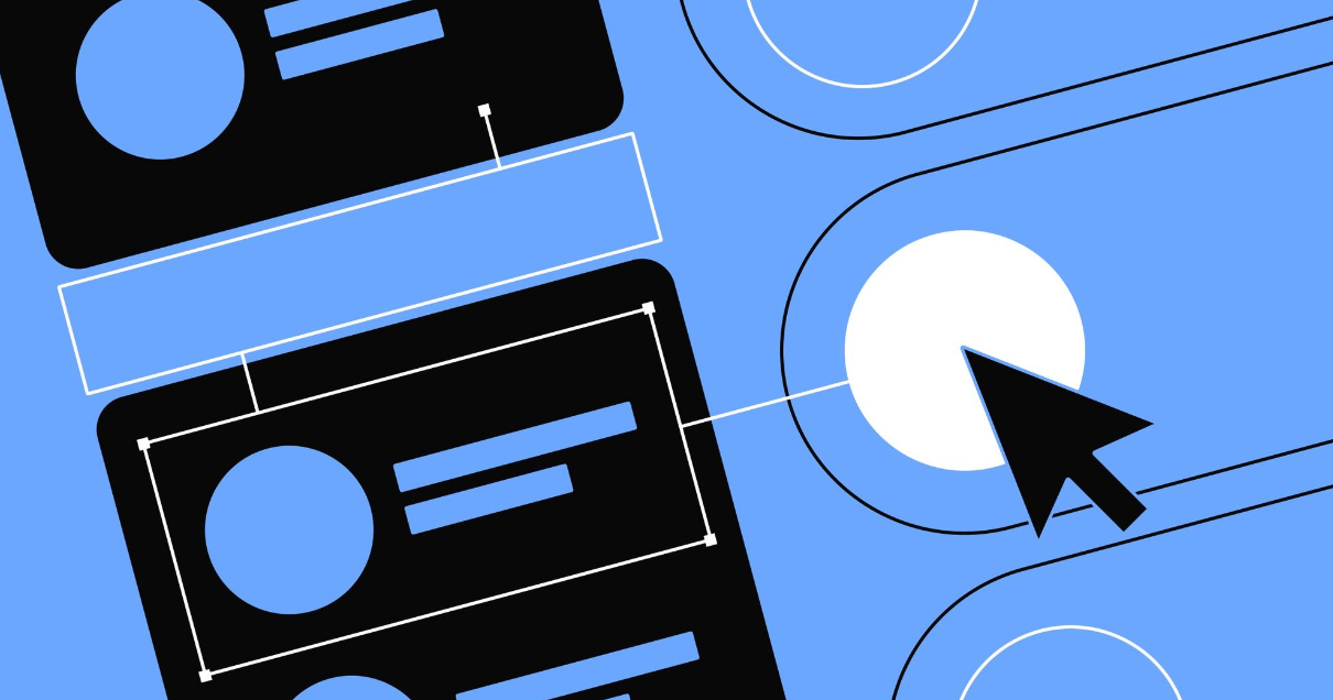
Web forms. They’re central to product design (as many products essentially consist of forms from the user’s perspective) and typically the most crucial component of any web page they feature on. Given their significance, you might assume that after 25 years of crafting them, we would have perfected forms.
However, that’s not entirely the case.
Well, we do have a fairly good grasp of forms, but the knowledge seems to be somewhat unevenly distributed. Let’s examine some of the prevalent issues associated with web forms and explore ways to enhance them.
Label all the things in the field
You know what’s great? Field labels that stay visible even when I click into the field. I appreciate having a reminder of what the field is asking me.
But, like many brilliant ideas, this one falls short in practice. It creates problems for people with cognitive impairments and for the rest of us. When we fill out forms, we’re usually on autopilot. We don’t pay close attention to each field’s label and what we’re typing into it.
So, having the label in sight to remind me what I’m doing is super useful. It helps me work faster and ensures I don’t have to delete or cut entries I’ve already made just to double-check if they’re right.
This doesn’t mean you have to stick to standard form design practices. If you want to magically move the label out of the field and position it above when I click inside, go ahead.
But personally, I don’t mind either way.
Why Can’t We Use Social Media to Sign In?
I mean, who wouldn’t want the convenience of signing in with just one click, right? Well, maybe not so fast. I have to admit, it does seem a bit reckless to hand over our social media info to every app that asks for it. After all, social networks can disappear pretty quickly. Just look at Vine!
But let’s be real, it’s also incredibly satisfying. Social logins feel like a magic key to the entire internet. It’s as simple as allowing the app access, and voila! I’m in. So much better than filling out endless forms.
Sure, there are plenty of reasons not to use social login, so I won’t push too hard on this one. But it’s something to consider, and if you decide to use it, here are a couple of key points:
- Give me the option to sign in with my email, just in case I’m not keen on handing over my social data.
- Be clear about what you will and won’t do with access to my social accounts, especially when it comes to posting without my permission.
Totally use terms like “invalid” in error messages
Sure, feel free to decide what’s valid. You’ve definitely done extensive research on the special characters people actually use in their names, right?
I recently discussed the use of terms like “invalid” in error messages, so I won’t dive into it too deeply here. However, when crafting error messages, it’s crucial to be informative and supportive. Labeling an entry as “invalid” can be not only potentially offensive but also unhelpful because it doesn’t clarify what a “valid” entry should look like. So, please, just tell me your requirements clearly.
Calling an entry “invalid” isn’t just unhelpful; it could also be offensive because it doesn’t clarify what a “valid” entry should be.
Sure, request my “username.”
Because I absolutely want another thing to keep track of, in addition to all the emails and passwords for the other 120 websites I’m registered on.
Are we stuck in the 90s or what?
Here’s a revelation: the idea of an anonymous internet has been studied and found to be not very important. So, unless your website specifically requires a barrier between my online persona and my real identity, please do away with this unnecessary complexity. It only increases the mental effort and makes me more likely to click the “help me log in” button.
Of course, there are websites where anonymity (or the exciting possibility of it) is indeed a key part of the offering. Keep doing your thing. Additionally, I can understand the security rationale behind requesting a username, as it adds another layer of defense against potential hackers.
However, for the majority of websites and forms, it’s an unnecessary inconvenience. Even for those sites that genuinely require it, a brief explanation like:
“Creating a username helps keep your account more secure, as it’s harder to discover than an email address.”
Could greatly help alleviate my perception that you’re needlessly complicating my life. Remember: your customers aren’t aware of your processes or the reasons behind them. So, what’s the harm in sharing this information with them?
Don’t let me see what I’m typing
I understand the security concern. The bullets are there to prevent anyone from seeing the characters I’m typing, a basic security measure.
However, could you provide me with the option to take the risk? I’m in a secure environment, sitting comfortably in my office chair, with no one looking over my shoulder. Can I have the choice to reveal the characters?
Improving our web forms
Looking at all my complaints about form experiences, one thing becomes very clear: great forms require clear communication.
For example, keeping labels visible and not making them disappear when I click: that’s clear communication. Avoiding terms like “invalid”? That’s right, it’s about communication. Providing me with important information before I make a mistake? You got it.
Communication also plays a role in the security issues I’ve pointed out. Without knowing that these measures are in place to protect me, they just seem needlessly annoying. But if these websites took a moment to explain their purpose to me… well, that could greatly improve my relationship with the brand, couldn’t it?
Of course, the other important factor is making things easier for me, reducing the mental effort by allowing me to sign in with a social network, offering helpful error messages, and so on. So, be sure to look for ways to simplify your forms, including asking only for necessary information.