Color theory is a set of rules and ideas about how to mix colors and create beautiful combinations. If you’re a designer, learning the basics of color theory can help you make attractive color schemes for things like graphic design and web design.
Color theory is a blend of science, psychology, and feelings, which makes color an important part of design. It all began with Sir Isaac Newton’s color wheel, showing how light produces a range of colors. Color theory has grown over time, revealing the science behind why some colors look good together.
Color psychology also plays a role. Factors like culture, history, and emotions affect how people react to colors. When you understand color theory, you can use science and psychology to make your audience feel certain emotions and react in specific ways to your design.
Before we get into the theory, let’s go over these key terms:
Primary colors
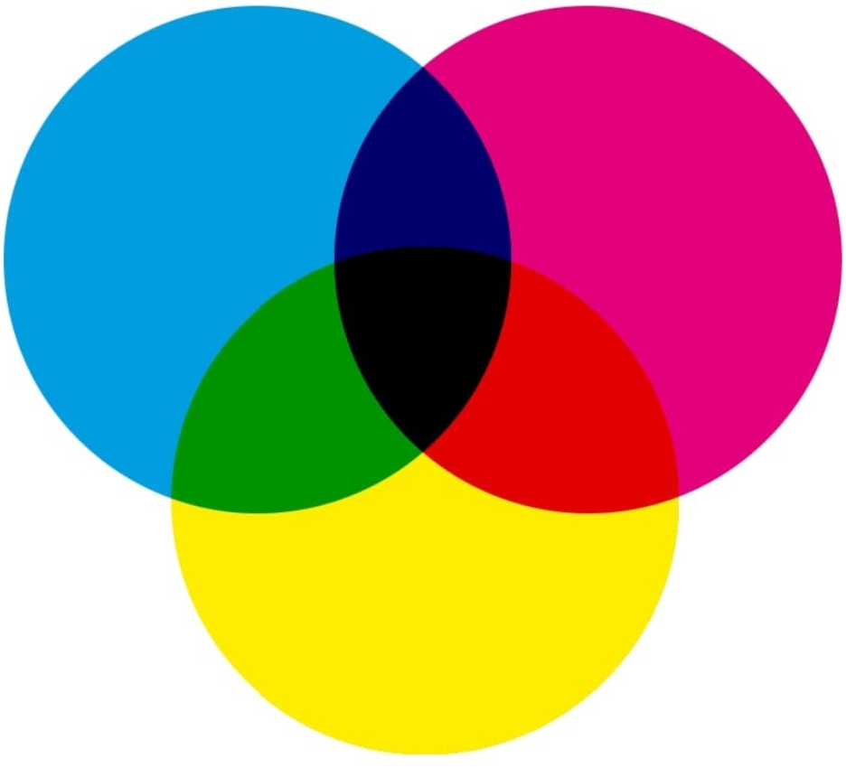
The primary colors are the foundation of all other colors. We perceive three main colors: magenta, cyan, and yellow (CMY). Every color we see is made by mixing these three colors in different ways – changing the amounts, brightness, tints, and shades.
Traditionally, we thought of red, blue, and yellow as the primary colors. However, research has shown that magenta, cyan, and yellow better describe how we see colors. You’re not alone if you associate these colors with printer issues due to a lack of magenta ink. The CMYK color model – cyan, magenta, yellow, and key (black) – is used in color printing. It’s called subtractive because it removes red, green, and blue from white light.
RGB and hex
On the web, we use RGB and hex values to represent colors. RGB is an additive color model that creates colors by adding colored light to black.
RGB defines colors using three values: red, green, and blue. For example:
- rgb(59, 89, 145) equals Facebook blue
- rgb(0, 0, 0) equals black
- rgb(255, 255, 255) equals white
Hex values convert these to a base-16 representation, like:
- #3b599b equals Facebook blue
- #000000 equals black
- #ffffff equals white
Each pair of characters represents a color value, e.g., 3b for red, 59 for green, and 9b for blue in Facebook blue.
Hot and cold
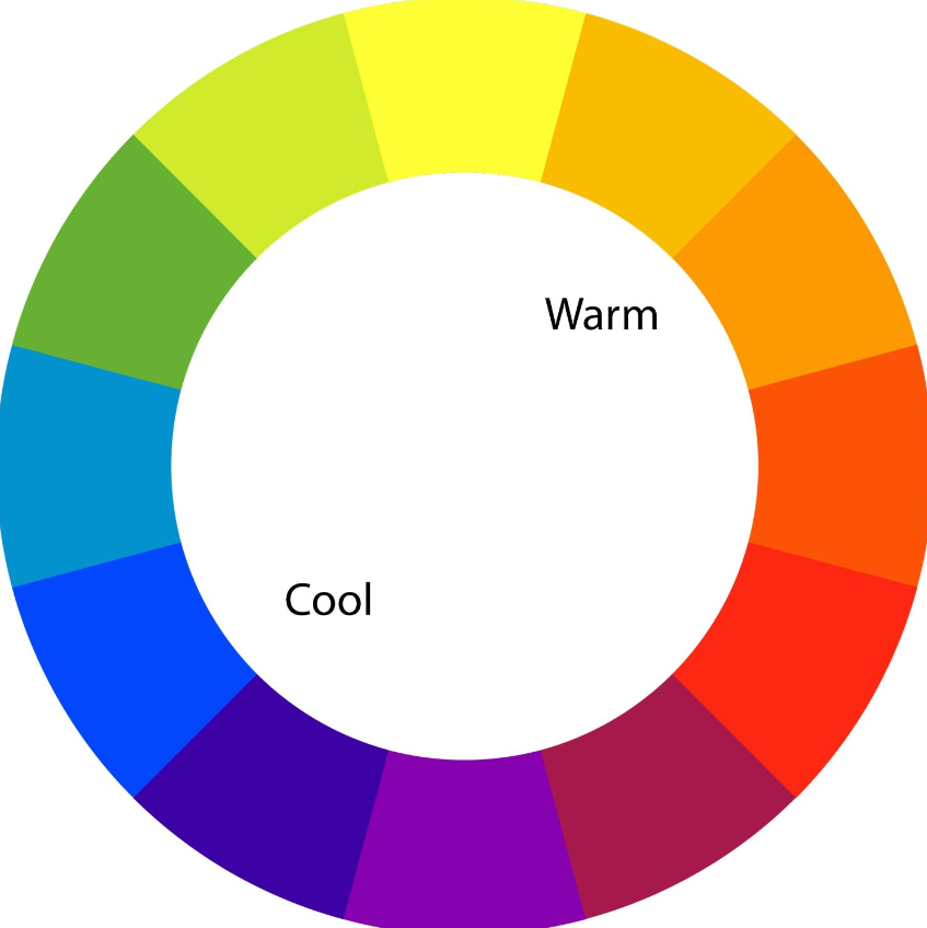
Colors can feel warm or cool. Warm colors have more reds and yellows, making a design feel warm and passionate. They can also be bold or aggressive, like red in error messages. Cool colors have more blue and can remind you of cold things like ice or water. They can also feel lonely or sad, but they can be soothing too, like a blue sky or calm blue waters at the beach.
Color temperature
Making an image warmer means adding more orange tones, which can make it look happier, like a sunny day. On the other hand, creating an image cooler adds blue tones and makes it seem colder and less inviting, like a cloudy day.
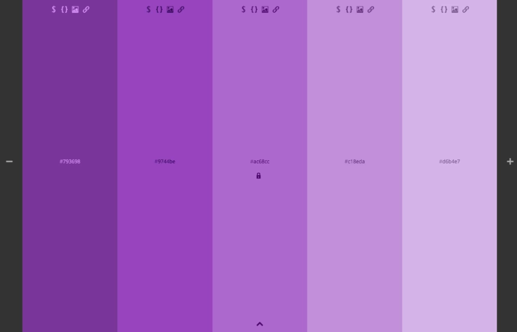
Tints and shades
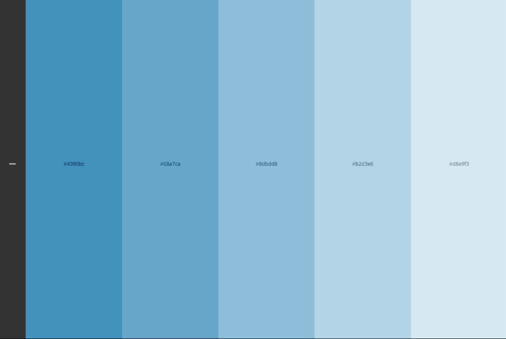
To make a color lighter, you add white; to make it darker, you add black. Tints and shades help you create color schemes by mixing white and black with a base color. For instance, if your base color is a light blue, like #8dbdd8, you can create a color scheme by selecting two lighter blues (tints) and two darker blues (shades).
Saturation, hue, and lightness
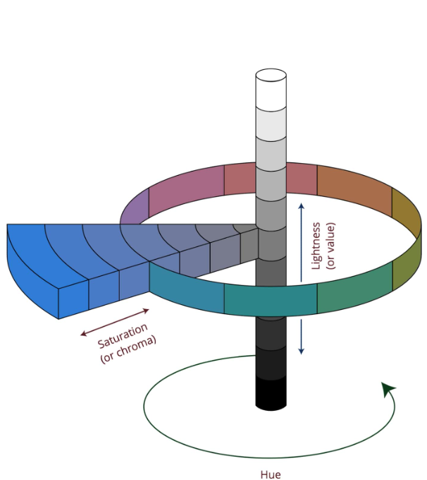
Saturation tells you how intense a color is. More saturation means it’s richer and darker, less saturation makes it lighter and faded. When we say “light blue” or “dark green,” we’re talking about saturation. Hue is how much a color resembles red, orange, yellow, green, blue, indigo, and violet (the colors of the rainbow). When you say “blue-green,” you’re talking about two hues. Lightness, or value, is about how bright a color looks compared to pure white.
The color wheel
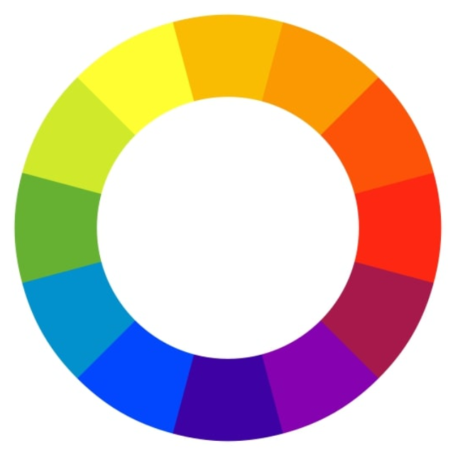
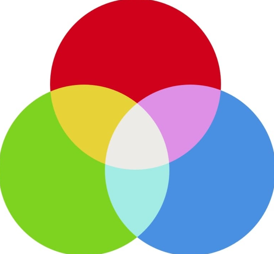
The color wheel has 12 main colors, and each slice shows different shades, hues, tints, and mixes. For instance, you can get colors like yellow-orange or red-orange by mixing yellow and orange. The primary colors are red, yellow, and blue. The secondary ones are violet, orange, and green. Everything else is a tertiary color, made by mixing primary and secondary colors. Designs use the color wheel for five types of color schemes.
5 types of color schemes
Designers make color schemes by combining different color families from the color wheel. This works best when using specific patterns that create color harmony.
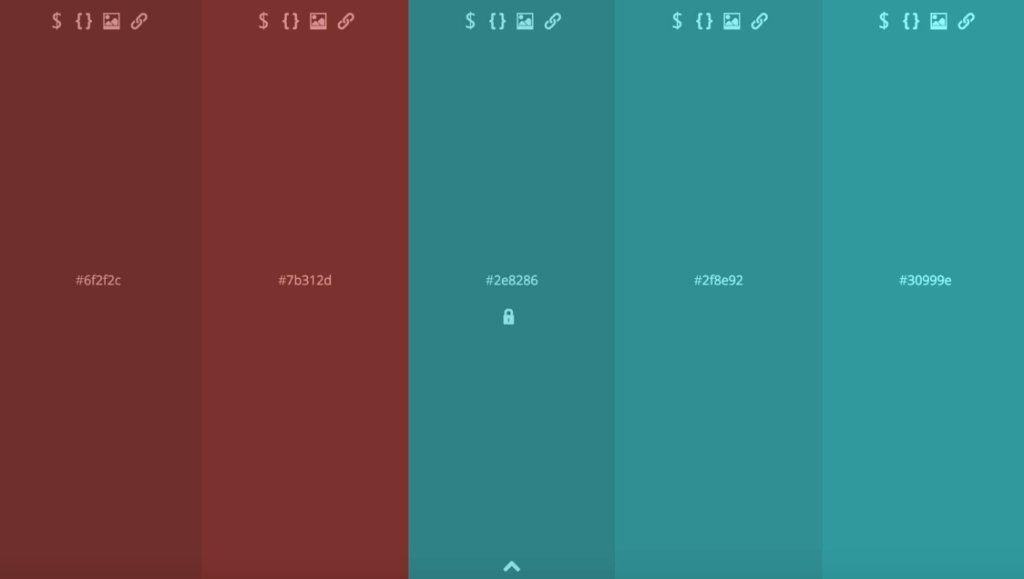
Monochrome
A monochromatic color scheme includes different variations of a single base color with various tints, shades, and saturations. These schemes are very unified but can become repetitive.
Complementary
Complementary color schemes use two colors that are opposite each other on the color wheel. This creates a strong and eye-catching contrast due to the significant difference between the two hues. Split complementary schemes involve one primary color paired with two colors that are adjacent to its complement.
Analogous
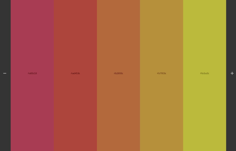
Analogous color schemes include three colors that are adjacent to each other on the color wheel. These schemes offer a harmonious and unified look due to their similar tones, avoiding the potential monotony of a monochromatic scheme.
Triadic
To create a triadic color scheme, imagine an equilateral triangle on the color wheel and choose the three colors at its points. This triad results in a balanced and diverse color scheme.
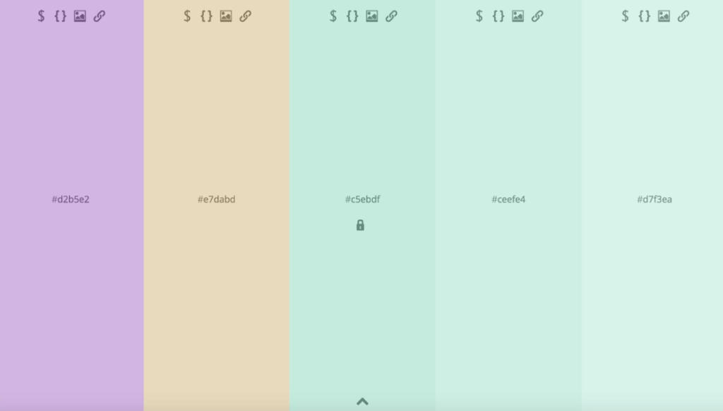
Tetradic
A tetradic color scheme involves four colors evenly spaced on the color wheel. These four colors can create either a square or a rectangle, so some references categorize them as square or rectangular color schemes.
Use color theory in your designs.
In your designs, remember that color is a powerful tool for evoking emotions and establishing brand identity. Think about how some brands are easily recognizable just by their colors, like Coca-Cola’s red or Starbucks’ green. Color can be so closely associated with a brand that it becomes a legal trademark, as seen with T-Mobile’s magenta.
Whether you’re choosing complementary colors for a logo or creating a complete web design color palette, applying the basics of color theory will enhance the visual impact of your designs. Use your newfound knowledge of color to add zest to your creations.
For additional color resources, visit Webflow University, where you’ll find tutorials for beginners and advanced designers. These tutorials cover topics like color values, color contrast, and more.