Author: simonc

The Best Ways to End Your Blog Post to Generate Engagement and Drive Traffic

Did you know that the end of a blog post is where you can strengthen your community? I’ll tell you seven good ways to finish a blog post that will help your blog community grow and get people talking.

But remember, it’s important to write blog posts that are good and that make your readers feel inspired, learn something, or enjoy themselves. That’s what makes people want to read more of your blog. Still, the very end of a blog post is the most important part.

When you finish your blog post, your main aim should be to put something that gets your reader to do something. These seven ways to conclude a blog post give you plenty of ideas to try and see what works best for your blog topic and the people who read it.

Ask A Question

One of the simplest and most interesting ways to end a blog post is by asking a question. Just make sure it’s an open question, one where the answer can’t be just “yes” or “no,” and it should be related to what you wrote about.

For instance, a good open question for this post could be: “How do you like to finish your blog posts successfully?”

This encourages your readers to interact and share their thoughts.

You can also learn about other questions they might have, which can give you ideas for new blog posts. Remember to respond to their questions and comments to show that you’re paying attention and just as interested as they are. That way, they’ll want to keep coming back for more!

Offer A Free Offer Using An Opt-In Form

Sharing a fantastic free download is a smart idea if you want to grow your email list.

This is a fantastic way to end a blog post for anyone looking to increase their email list. I like to offer something related to the topic that benefits my readers.

You can provide a file for download or invite readers to join an email course. It can also be as simple as asking them to subscribe to weekly or monthly newsletters.

The important thing is that it should add value to your blog post or be intriguing enough to encourage people to share their name and email. Use words that explain how your freebie can help solve a problem for your readers.

Request Readers to Share Your Post

Another way to end a blog post is by asking your readers to share your content with others. Some bloggers have a short paragraph that goes like this:

“If you found this post helpful, please think about sharing it with others! Thanks!”

It’s a friendly way to suggest that they share your blog post.

If someone has read all the way to the end, it’s likely they found it interesting. So why not click a button to share it on social media?

That’s why it’s important to create content that’s so interesting that readers will keep scrolling, read it, and really want to share it. It’s a great way to get more people to see your blog and increase your website’s traffic.

Add A Pinterest Pin Image

Pinterest can bring lots of people to your blog. You want folks to share your pins with others.

Pinterest pictures are usually big (around 1000 x 1500 pixels or even larger). They can take up a lot of space in a blog post. The good news is that if you use WordPress blocks, you can make them smaller.

If you put them near the top of your post, people have to scroll down quite a bit to get to the text.

I’m not saying you shouldn’t put them near the top, but a Pinterest pin is more likely to be shared if you place it at the end.

Why? It’s because someone really liked your post and wanted to save it or show it to others.

Like with requests on social media, I’ve noticed that when I put the pin at the end of my post, I have the best chance of getting it pinned by others.

Creating attractive Pinterest pins is a great way to catch your reader’s and Pinterest users’ attention.

It’s one more way to make your blog more visible and get more people to visit it.

Include An Invitation To Reach Out

How can you end a blog post and make people want to talk to you?

One way is to invite them to ask you questions!

If you run a consulting or coaching business alongside your blog, you might want potential clients to get in touch with their questions.

Giving a short but useful answer to one question for free can help build trust in you. It’s like a magnet that draws potential customers closer and helps you build a good relationship with them.

If you see a chance to offer more services, this is a great way to get someone interested to connect with you personally.

To encourage readers to contact you, you can use a special paragraph in italics or a box (maybe in a different color if you’re using WordPress blocks).

A Call-To-Action To Purchase

Do you have something like a digital download or a product that your readers might want to buy? This is where you can put a picture and a link to the page where they can buy it.

This is a good way to finish a blog post if you want to make money from your blog.

Just keep it simple and put a link or a picture that people can click to go to your online store or the page where they can buy your product.

For instance, I might share a blog post about an ebook or a course that I have on my Confident Blogger Academy website.

Another option is to add affiliate links. Some tools like Lasso are great for making galleries and showing products that you get a commission for. You can put these at the end of your post as suggested products or resources, and it can start a conversation.

A Link To Other Useful Sources

A great way to finish a blog post is by giving links to more helpful stuff.

Maybe you don’t have all the answers, but there are other bloggers or organizations with great information.

Don’t hesitate to share amazing content from other websites.

Google also notices when you link to good, highly-rated content. And your readers will see you as a valuable source of information on that topic.

They might even save your post and want to come back for more!

About the Author: simonc

4 Font Hacks to Increase Your Blog Traffic and Engagement

You might not be aware, but the font choices you make for your blog can significantly impact how many people engage with your content. The number of people engaging with your content can make a substantial difference in whether a post becomes widely popular.

How significant is this impact? According to some sources I’ve come across, a simple mistake with colors alone could potentially reduce your readership by a factor of five. Even if you’re not making that particular mistake, there’s a good chance you might be making at least one of the other four common ones. In this article, I’ll share the five most crucial best practices for text presentation to ensure your readers stay engrossed in your content rather than reaching for the back button.

Font size—16px minimum

One of the main problems with reading on websites is that the text is often too small. A long time ago, in 2005, a guy named Jakob Nielsen did a study about website design problems. In this study, he found that people’s biggest issue was that the text was too small. Nearly twice as many people complained about small text compared to the next problem on the list.

Unfortunately, this problem hasn’t gone away. If we look at some of the latest blog designs on a website called SiteInspire (which shows off cool website designs), we see that the average font size for the main text is really small, about 12 pixels. Some are even tinier, going down to 10 pixels, and none go above 14 pixels. Even if we check out popular themes from Elegant Themes or ThemeForest, we’ll see that they also stick with these small font sizes.

But there’s an expert in making websites easy to use and read named Oliver Reichenstein, and he tells us that 16 pixels is the font size that web browsers are supposed to show as a default. And 16 pixels isn’t even big. It looks about as big as a 12-point font in a book. Many people, especially those over 40, have a tough time reading smaller text. This 16-pixel size is the size most people find comfortable reading.

Use dark-on-light text—reversed is no good

Thankfully, we’ve mostly left behind the days when people used strange color combinations for text, like fuchsia on blue. However, using white text on a black or dark background is still quite common. This can make it hard for people to read and understand your content because it strains their eyes. Staring at white text on a dark background for a while can make it seem too bright. Depending on the studies you look at, this text style can reduce the number of people who read your content by 50% to 400%.

Why take the risk of losing so many readers? Using black or very dark gray text on a white background looks clean and is easier to read. Plus, there are many great themes that use these colors.

Line width—45 to 75 characters

Many blogs don’t follow this lesser-known rule. To make it easy for your eyes to move from one line to the next, you should aim for about 75 characters in each line. This is called the “line measure.” If the measure goes beyond 75 characters, it becomes hard to smoothly go from one line to the next without losing your place.

On the other hand, if you have fewer than 45 characters in each line, your eyes can get tired quickly. You start reading one line, but then you have to jump to the next one almost immediately. It feels like you never get a chance to take a break.

So, the best text area for your blog post should have lines of text that are around 60 characters long. But you also need to think about how it looks. Following the “ideal” measure on some blogs can leave too much empty space on the right side or make the text look too squeezed together. For that reason, I use a measure of around 70 characters on my own website. However, if you go past 80 characters, you’ll definitely reduce the number of readers.

Line height—130% or more

This mistake is not so common, especially if you’re using a good theme. But let me explain it in a simple way. When you’re reading text, the space between the lines matters.

For example, in this paragraph, the lines are very close together. It makes the text feel crowded and not so nice to read. It’s also hard to follow from one line to the next because they all blend together.

On the other hand, in this paragraph, there’s a lot of space between the lines, like double spacing in a word processor. But it feels like the lines are too far apart, and it’s not a good choice for most writing unless you’re working on a research paper.

Now, in this paragraph, the space between the lines is just right. For every pixel of text size, there’s one and a half pixels of space between the lines. This is a good balance for most fonts you’ll use on a blog. But you can also try different spacings, between about 130% and 160%, to see what looks best for your content.

About the Author: simonc

Why Website Header Design is Important

Like the subject line of an email or the envelope face of a direct mail piece, a website header is the first impression. It is the deciding factor between whether users will stay or go. The header needs to be inviting and engaging. It needs to cover all of the bases on communicating the who, what, why, and how of a business. And it needs to do it well.

What is a Website Header?

Web pages are divided into content sections with the header located at the top of the page. Some websites use the same header for all pages, and some use a prominent header on the homepage and a slimmer version on subpages. In fact, homepage headers are taking up more and more space with a trick borrowed from print journalism that utilizes the space ‘above the fold.’

In print journalism, this refers to the top half of the front page, which is the most viewed real estate in the paper. Similarly, this includes the space on the home page that fits in one standard viewing screen with websites.

More and more designers are utilizing ‘whole page’ headers that cover the entire top one-third or one-half of the homepage. This is a smart trick, and it works well to highlight all of the important information without making things too cramped.

What Belongs in the Header?

Proponents of ‘above the fold’ header designs are likely to have a longer must-haves list for header information. Whether your website design favors minimalism or extravagant-ism, there are some key components that users expect to find in the header, and they will become quickly frustrated if they are missing.

Branding

At a minimum, your company logo and name belong in the header. The first piece of information that users look for is confirmation that they have landed on the correct web page. Seve these details up in the top left corner of the header where users expect to find them. Additional branding elements like colors, fonts, and images should be present throughout the entire design.

Navigation

The next place that users will go is looking for a way to get around. Websites are expected to have simple navigation menus in the header (and sometimes the footer) of each page. These menus can stretch horizontally along the width of the header, or they can expand vertically from the bottom right.

Search Box

A free-form search box is another expected element that caters to users who know what they are looking for but don’t want to put thought effort into what menu you might put it under.

Contact Information

Especially for service-based organizations, don’t hide the contact information. Make the preferred method of contact a prominent element in the header with a button linked to a form or a phone number. Skipping this key element hurts credibility.

Call to Action

Going back to marketing 101 principles, make sure you tell them what you want them to do. With all of the information available on a website, users easily get overwhelmed. Adding a call to action is a simple and effective way to boost conversions.

Shopping Cart

For e-commerce websites, shopping cart access is essential. You need to keep the cart visible for shoppers the whole time they are on your site because if it becomes too difficult to figure out how to check out–they won’t, and you will lose sales.

Attention Grabbers

High-quality images and professional videos add visual interest and enrich the user experience. Using these elements, you can add more information to the header without overwhelming the design. Consider using image sliders to highlight products or specials. Video is good for building trust and telling stories, and it works exceptionally well for grabbing interest.

With all of the information that can or should go into the header section, it is very easy to overwhelm users. This is where good design principles come into play. You want to make sure that the header includes all of the necessary information and displays it creatively, but you don’t want the quantity to take away from the quality.

Best Practices for Header Design

A great header starts with good planning and is executed with great design. But what is great design? There is a fair amount of creativity that goes into the process, but artistic expression aside, there are best practices that can ensure a successful design.

Header Size

While there is not a standard header size, it is important to note that a good design will be consistent across the pages. One approach is to use a large-format header on the homepage and a minimalist bar header on subpages. Another approach is to compromise between the two and use the same large bar header on all pages.

Visual Hierarchy

A great design will remain rooted in graphic design basics like maintaining balance in the visual hierarchy. What does that mean? Visual hierarchy refers to placing the most important information first, and in larger sizes and descending placement and font size, the importance of the information descends.

Did you know that people tend to read web pages in an F shape? This is different from how they read print pages, but it is important for the placement of information. The single most important spot on a web page is the top left corner of the header. This is why your brand details like a logo and your company name go here.

Visual hierarchy elements to utilize in your design include:

  • Font Size
  • Style and Texture
  • Color
  • Contrast
  • Placement
  • Use of White Space
  • Repetition
  • Alignment

Keep in mind that, although you have a lot of information to cover, less is more when it comes to creating a clean design. The header should use plenty of white space so that readers see the important information without getting overwhelmed.

Sticky Headers

Will your web page header remain static or scroll with the page? Sticky headers that scroll with the page are becoming increasingly common because they keep important information in view at all times. Remember all of those details like contact information, shopping carts, and the call to action that should be part of the header design? That information is still vital even as the user scrolls down the page, so why not keep it in view?

Header Copy

What is copy? It is the words you use to describe your brand, convey your messaging, and sell your products. And, the wording is more important than you might think. There is a lot of data behind how many characters and how many words to use for headlines and for a call to action. How do you choose the best words to convey a message when you only have eight?

The copy in your header is more than just words; it is a curation of carefully selected words to evoke emotion and inspire action. Your brand voice and website goals will direct the choices you make for what and how much copy to include in the header. But here are some ideas to get you started.

What types of copy to put in the header:

  • Attention-grabbing Headlines
  • Trust-building Context
  • Action-inspiring Offers

Final Thoughts

Every element of a web page header is important. The content, design, copy, and media work together to communicate information about your brand and your website. If the story isn’t clear or doesn’t engage and compel action, the entire website loses traction as a sales and digital marketing tool. Designing an effective header is paramount to designing an effective website.

About the Author: simonc

How to Write SEO-Friendly Content

Even the best online writing is ineffective if no one can find it. Get some eyeballs on your content. Learn search engine optimization (SEO) so Google will list your masterpieces higher in its rankings.

Choose SEO Friendly Topics

Search optimization should begin before you ever write a word. Many bloggers treat SEO as an afterthought. They write on any topic they want and then attempt to make it SEO-friendly.

Find out what keywords readers are using in their searches. Google “how to find keywords,” and you will see keyword search tools. Some are free, while others are paid services.

Type a word into the tool to see related words and phrases. Each entry shows the number of searches per month. You will also see whether the competition is high, medium, or low.  The figure refers to how many advertisers use the word or phrase in their content.

Tip: Your best choices are keywords with low competition and a high number of searches per month.  Select one of these as your focus keyword.

Find Additional Keywords

Google does this work for you. Enter your focus keyword as a Google search term, scroll to the bottom of the results, and you will see “related searches” listed.

Use keywords from these suggestions to broaden the reach of your blog.

Tip: Don’t “stuff” your articles and blog posts with keywords to the point that it sounds awkward. This can actually lower your ranking. Use a keyword two to three times at most in a blog-length piece of, say, 500 words. Double that for an article of 1000 words, and so on.

Write Your Headline

Write an appealing headline that uses your focus keyword. Even if the keyword sounds “dry,” use some emotional words around it.

You can find free analyzers that rank the effectiveness of your headlines. This is a great way to learn to write headlines that are both catchy and searchable.

Tip: Write three to four headlines for your piece to see which ranks the highest in headline analyzers.

Make Your Text Readable

Online grammar and spelling tools will suggest words that will make your blog post more readable.

Readers recognize certain words and phrases more readily than others. Review the suggestions from the grammar tool and incorporate them as much as possible.

Tip: Don’t replace all of your uncommon words. A few may attract readers who use less popular search terms.

Place Images in the Text

Search engines rate your writing on how easy it is to read. Images raise your ranking because they make content more understandable.

You don’t have to become a photographer. Search for “royalty-free images,” and you will see many companies that provide pictures you can use.

Tip: Images in the text itself are more likely to improve your ranking than images above or to the side of the copy.

Get Started

You now know how to write SEO-friendly content. There’s a lot more to learn, but don’t wait until you’re an expert to begin writing. Expand your knowledge as you go. Happy writing.

About the Author: simonc

How to Optimize for Voice Search

Those blue-ringed speakers where Alexa or Echo lives once seemed like novelty items. However, by 2022, smart speakers will be in 55 percent of U.S. households, according to Edufficient.com.

A voice search means using your voice to interact with a search engine rather than through text. Over a third of the US population uses voice search, says EMarketer.  Soon enough, running voice searches will be as routine and instinctual as brushing your teeth.

That means you need to prime your website so your target audience can find it when they decide to talk to Alexa or Siri. This article will walk you through how to optimize for voice search.

Voice searches vs. manual searches

Voice search optimization and manual search optimization aren’t completely different animals. However, there are some key distinctions with voice search that are worth paying attention to:

  • Voice search page results load 52 percent faster than the average page (Backlinko).
  • Manual searches generate a list of links. You might find the answer you’re looking for in the fifth link down the page. Voice searches only return one answer to searchers—the best-optimized result.
  • With voice search results, title tag optimization isn’t as important as it would be in regular desktop searches. That means it’s not as important to make your content’s title tag match the search query text. Basically, you don’t need to create a piece of content for every single keyword. Since so many people use voice searches, it would be impossible for Google to find a page for every search query. Instead, Google explores the entire page to find the best match for that particular voice search.

How do you optimize for voice search?

1. Brainstorm the questions people are asking their Google Assistants, Sonos Ones, and other virtual assistants.

People use voice search to ask questions, and you must create and optimize content to deliver relevant answers.

When you run a voice search, you usually access the first result that comes up, rather than scrolling down the page and sifting through content as you might with manual searches. Therefore, you need to be focused on finding the questions people are asking and answering them.

How do you find these questions? If you have a virtual assistant, try asking it questions and seeing what answers it gives. If you have a paid tool like SEMrush or Ahrefs, you can look at your organic keywords to filter for questions like the 5ws, how, etc. Looking up competitor keywords can give you ideas as well.

A couple of free methods are using AnswerthePublic.com, a search listening tool, and Google Autocomplete. Google Autocomplete runs off of data from actual searches and can be a source of inspiration.

With Answer the Public, you type in your subject and it will generate a search cloud of questions people are asking. The tool groups the questions with words like the 5 Ws. Other category words include ‘how,’ ‘which,’ and ‘will.’ The questions have green dots, and the darker they are, the more people are asking that specific question.

2. Focus on long-tail keywords in your content. Voice search queries are longer than manual searches due to their conversational style. Google is fond of long-form content—the average voice search result on the first page of Google has over 2,312 words. Quality long-form content with more words has more of an opportunity to match search results.

Content creators can develop long-form content that includes long-tail keywords that appear in vocal queries. One example is: “How can I optimize my site for voice search?” SEO experts recommend that marketers focus on long-tail keywords with filler words to give their content a leg-up in search engine rankings.

3. Answer the question and keep your answer short and sweet.  It means making sure you directly answer the search query within the content and keep it concise. As discussed before, you don’t have to mention it in the title or introduction.

The content should be simple and easy to read. The average voice search result is written at a 9th-grade level. Google also recommends that voice search answers also have proper pronunciation and prosody.

How should you format your answer? Ask Google your question and listen to the answer. If the answer is a short paragraph, go with that answer form. If it’s a list with bullet points, choose that option.

4. Make sure your page loads fast. The average voice search result page loads in 4.6 seconds, as opposed to an 8.8 second load time for the average page to load completely.

Imagine if users run a voice search query, find your website, and hear a long silence as your web pages load. It frustrates users and makes them more likely to abandon your web page.

SEMrush has a few extra tips for improving page load speeds:

  • Use compressed images and videos on your site.
  • Use “async” and “defer” to reduce JavaScript parsing.
  • Use CSS3 and HTML5 frameworks because they load mobile web pages quickly.

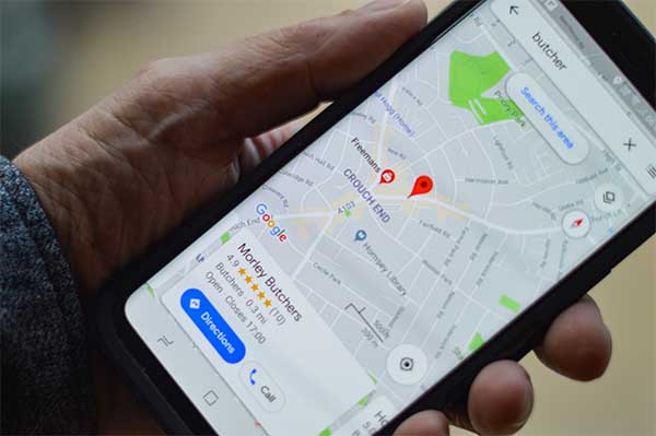
5. Get a Google My Business profile—it’s free. Nearly 60 percent of people use voice search to find information about a local business. Setting up a Google my Business profile improves your local SEO and lets Google know that your business is located at a particular place. When a searcher asks Google to show similar businesses in a certain area, your business could rank for that query.

Visit Google My Business to set up your free profile. You must include your business’s name and address [note: as of April 2021 phone numbers aren’t allowed in GMB listings]. Other important elements are business hours and relevant photos. Be sure to continually update your information to give searchers the answers they’re looking for.

Conclusion

Over the past several years, marketers have said, “Pay attention to mobile.” Now voice search needs to be as big of a priority. Voice searchers often focus on one resultthe first result your virtual assistant digs up. Implement the strategies in this article to make sure your business is that result.

About the Author: simonc

How to Optimize Google My Business Listings

What is Google My Business?

Google My Business (GMB) is an essential tool designed for local small businesses to increase visibility and reach.

The free tool offered by Google is one of the easiest and quickest ways to optimize local SEO. In a few moments you can create a Google My Business listing that will rank you high on Google’s search ranking and make your business visible on Google maps.

GMB enables users to communicate with their current customer base and attract new customers. Through the posting of pictures, maintaining accurate contact information, and posting relevant updates, a GMB listing provides more value to a local small business than any other medium. Especially for the amount of time and money it takes to manage the listing.

If you have more than one location, no problem. Multiple locations are easily managed through the GMB mobile app regardless of your chosen device.

One of the most important components is that it provides opportunity for the business owner and customer to respond directly to each other through reviews that may contain praise or criticism. These interactions are not always polite, but they should be. It is important to the survival of a business that the owner, with thoughtful consideration, respond in such a way as to assure the customer that the message was received, loud and clear.

Did you know you can update your business hours according to the perfect storm of the corona virus and global protests we’ve all been going through? It is unlikely, that any time soon, a small business will return to previous open and close hours.

How To Optimize Google My Business

Optimize is just another word for staying current.

June Bloom, operates a coffee shop in San Francisco. Coffee shops are highly competitive enterprises in the Bay Area and thanks to COVID-19, many small businesses have been tossed to the curb, increasing the demand for businesses to adjust according to the current health crisis. Since reopening, Junes Coffee Shop has not rebounded from the past few months of being closed down. Social distancing is still required and that limits the number of customers she can seat at any given time.

Is there anything that June can do to help her now struggling business survive the current crisis?

Unoptimized vs Optimized Listings

The most significant thing June can do is to remain open and adjust from there. Beyond that, there really isn’t much more she can do. Though it will present a variety of challenges along the way, this is a time for small business to wrestle and grapple with the fact that life is not going to be the same for quite some time. We may never return to a pre-corona type of standard operating procedure. It’s time to really think out of the box.

An unoptimized listing is a listing that needs more information. Optimized listings are irresistibly compelling. An appropriate picture that shows internet users why your business is head and shoulders above everyone else. If all your GMB listing shows is the name of your business and where it’s located, that is not enough. Hungry diners, thirsty travelers, or anyone just looking for a cup of coffee, will want to know if you are open for business and if you are, what are you doing to keep everyone safe. Your GMB listing may be the first impression customers get of your business and now is the time to polish that portion of your storefront so that it shines in such a way as to attract and deliver.

June solved some of her inherent issues by snapping a few pictures of customers waiting in line outdoors. She then took pictures of one of her associates walking the line, taking orders. June even hired a classical guitarist to perform various classical guitar pieces for those people waiting in line. She took these three photographs and posted them to her GMB listing. She was also able to record her hired classical guitarist and post that video on her website where she featured it on her home page.

She didn’t need to tell anyone to smile; they were already smiling because they could get out of their house and receive some of the best customer service found in the City.

June found that she needed to think out of the box to increase engagement with her regulars, along with attracting new customers. Keeping her GMB listing current by updating hours of operation (which in no way resemble the hours she kept prior to the COVID-19 outbreak).

The GMB platform offers a wide margin of choices to select from that have the potential to help draw in new customers who in turn, by word of mouth through the use of reviews, will become your greatest resource for sharing what a great experience you provided.

“Hey, have you been to June’s Coffee House lately? “

“Why, no I have not. I didn’t even think she would be open with all that is going on.”

“Yeah, well she is open. There’s someone who monitors the customer line, making sure that everyone is wearing a mask, is social distancing, and is taking orders to help everyone get that cup of coffee, tea, or whatever other beverage they came in for. June has even hired this wonderful classical guitarist to play for those waiting in line.”

“Wow! Sounds like June is really working hard to make sure everyone can still have some sense of normalcy, even though, as they say, and I am not real sure if I agree or not, that this is a new normal. I hope this is not the new normal, but it does look like we’re going to be in this for quite awhile longer.”

Include Basic Information About Your Business

The first thing we recommend you do is, if you do not have one, is to create a listing. Open the google.com/business and follow the prompts. We hope you already have a GMB listing, but if you don’t, you are missing out on a great opportunity and resource. Missed opportunities mean a loss in potential customers. In today’s volatile economy, users Google a business they want to know more about. Like if the business is open, a phone number, hours of operation, reviews, pictures that show off your business in a favorable light, and a website.

Regardless of the type of business you own, you will want to include the following in your GMB listing.

  • Location
  • How to contact your business
  • Hours of operation

But if that is all the information you post; you might as well forget about attracting and engaging anyone to come to your place for a cup of coffee, a bite to eat, a haircut, or whatever it is you’re in business for. If you don’t produce a sparkly clean listing that engages people at first glance, your chances of someone coming in and ordering a latte are significantly reduced.

Valuable Tools of Engagement

Reviews, a Website Builder, and Insights, are three more tools that are designed primarily for the customer but assist the business owner in keeping track of how customers are interacting with their business.

Reviews

The following are just a few things to keep in mind when addressing reviews.

  • When responding to positive reviews, a simple thank you, we appreciate you business, may be all that you need to say. If you want to say more, than say it, but keep your comments simple and to the point.
  • When responding to a negative review, be apologetic and grateful. Try to offer a solution to their complaint. Be accountable. It’s not that the customer is always right, but when a customer takes the time to write a negative review, there is a lot of emotion involved and you should try to bear that in mind. Stay away from making excuses and blaming others. Instead of making excuses, find a way to make it right.
  • At a minimum, reviews should be checked weekly.

Website Builder

The Google My Business platform even comes with a free website builder. Consider what it takes to create a website on GMB and what the website could do to increase engagement.

  • The website takes less than 30 minutes to complete setting up.
  • The website is optimized for all devices, whether a desktop, laptop, iPad, or smartphone.
  • Open the GMB platform and select Website from the home menu.
  • Select a template.
  • Verify the accuracy of your GMB listing, especially the address, phone number, and hours of operation. Any time this data is updated, it is updated across all of Googles Business Listings for your business.
  • Include pictures of your business. Be creative and post 360 degree images providing an interactive experience for visitors.
  • Consider creating a virtual tour of your business.
  • Post informative and fun blog posts.

Insights

Insights is GMB’s tool for analytics. The following points explain what insights does for you.

  • Tells how someone searched and found your website.
  • Tells how many calls you received.
  • Tells how many requests were made for directions.
  • Tells you how many prospects or customers viewed your website. Use Google Analytics if you want to know what someone did while they were perusing your website.
  • Tells you how many click-throughs were made through image presentation.
  • Tells you what day and what time of day photos or videos were opened most often. In turn, this helps you determine the best time to post photos or other relevant content.

About the Author: simonc

Digital Commerce Capabilities to Future-Proof Your Business

Customer expectations and needs are ever-evolving and leaving brands under consistent pressure to integrate more advanced digital commerce capabilities simply to ensure survival in the retail landscape.

The way customers purchase, especially with a pandemic-driven surge in online shopping has catapulted the need for specific digital commerce capabilities which enhance user experience. functional, static websites are no longer enough to deliver a quality buying experience and foster brand loyalty.

B2B and B2C companies are exploring ways to improve customer buying journeys and providing personalized customer experiences (CX)  throughout the entire buying journey are essential to staying competitive.

Here are just a few e-commerce capabilities that need to be on your radar.

Artificial Intelligence and Machine Learning (AI/ ML): 
Smartbots and conversational AI have become expected and therefore a ‘must-have’  for customer service,  product enquiries and the like. Likewise, similar AI-driven programs for product recommendations and add-on options are just a few basics that AI and ML cover.

Ridesharing and food delivery businesses have mastered this with their use of chatbots throughout the purchase process, allowing customers to track order delivery, payment and customer service, for the most part without any human intervention.

Mobile Application, Commerce and Social Commerce: 
Having a website is no longer enough, especially when customers are showing a growing preference for mobile applications. The content typically loads faster than website content and from a marketing standpoint, it allows for higher user engagement, especially where push notifications can help boost conversion.

Consider the number of mobile phone users is only growing by the millions. Add to that the number of them with social media on their cell phones and the growing number of purchases made through those phones, social commerce is essential for your future roadmap.

A well-defined customer journey created for social platforms, including direct checkout/payment enablement, will keep you up to scratch. Brands are utilizing social media channels such as Instagram and TikTok to target customers with huge success. In particular, brands like Levi’s have even taken advantage of the platform by giving customers the option to shop directly through TikTok videos with the help of platform influencers.

Voice-Activated Ordering:
The growing number of people using voice-activated home devices such as Alexa and Siri are driving a boost in consumers using these devices for product and purchase information to help them with their buying decisions.

Augmented Reality (AR): 
Using AR allows buyers to see exactly what they’ll be purchasing in their own reality before they buy. For example, buyers can take a photo of a room and select a piece of furniture from a retailers site to provide a sneak-peek into how it’ll look in their own space.

Simply put, giving customers an immersive experience in their existing environment is a big win for product visualization, reducing storage and returns and providing rich content to enhance CX.

This is especially true for luxury or bulky goods where storage and transportation costs can be enormous.

Imagine a car company launches an AR app for dealerships. Now, instead of dealers needing to stock all the available options of one particular model, the app gives potential buyers a way of customizing and seeing their potential car in all the available colors, add-ons and modifications. The dealer saves on storage and operational costs and buyers can see all the available options in one place.

Click and collect: 
While the concept isn’t yet as heavily readily used in the USA as it has been in other countries, this concept of ordering online for out of store pick up is becoming significantly more popular, particular over the last year with contact-free delivery becoming preferred. It’s not cheap to set up and requires excellent inventory management, but works when a customer places an order and pay via the app after selecting their preferred pick up store location.

The customer arrives at their designated collection time, let’s the store know they’ve arrived via the app and can wait in the car while their item is delivered directly to their trunk contact-free.

Flexible Integration:  
Legacy systems can be clunky, inflexible and rigid. Now more than ever, if companies want to succeed, the need to move towards third-party solutions and platforms that integrate seamlessly.
For example, with open APIs, social media channels can be integrated with your commerce storefront This can be done by using open source systems such as Kubernetes on SAP Cloud Platform to extend and connect various applications. The same goes for headless systems like Spartacus, for mobile optimization, multiple payment platforms, etc. that help provide an omnichannel experience.

Customer needs will only continue to become more focused on experience, leaving brands no choice but to get their basics up to par. While these are just a few digital capabilities that should be on your radar, having a clear plan for implementing just one will have you on the right path for growth.

About the Author: simonc

How to Use AzCopy to Transfer Data to Azure File Shares

Azure File Shares provides cloud-based file shares using the SMB (server message block) protocol native to Windows clients and servers. Of course, a file share needs actual files and data to share. To that end, Microsoft has provided the AzCopy command-line utility to copy, move, and sync data up to Azure File Shares.

Capabilities

AzCopy has many different capabilities. A few of the common ones are listed below and a bit about how they work.

  • azcopy benchUseful to understanding how quickly a large amount of data can be transferred is the built-in benchmarking command. Running entirely in memory with configurable file counts and sizes, simply choose a destination and run the benchmark to see transfer statistics.
  • azcopy copyOne of the most widely used commands is copy. The most simplistic form is simply providing a source and destination without any flags. Beyond just transferring local files to a remote Azure File Share, it’s possible to transfer between different shares such as Azure Blobs and Azure File Shares without transferring files local.
  • azcopy jobsEvery transfer operation done by AzCopy creates a job which can be managed via the set of sub-commands to jobs. You can list all jobs, show a particular job, resume a paused job, remove an existing job, or clean older jobs.
  • azcopy listIt’s possible to list the files contained within an Azure Blob, but not currently in an Azure File Share.
  • azcopy makeThe ability to create a container or file share within a Blob or File Share. This may be better done using other tools, but allows for the quick creation of a new folder.
  • azcopy removeRemove files from an Azure storage account. This command also has the ability to run this recursively and with include and exclude patterns that offer more precise control over exactly what should be removed.
  • azcopy syncOnly available for Azure Blobs currently, this command allows for only transferring files that are newer than the last modification date. This does not delete files though, only overwriting of new files, if defined.

Getting Started

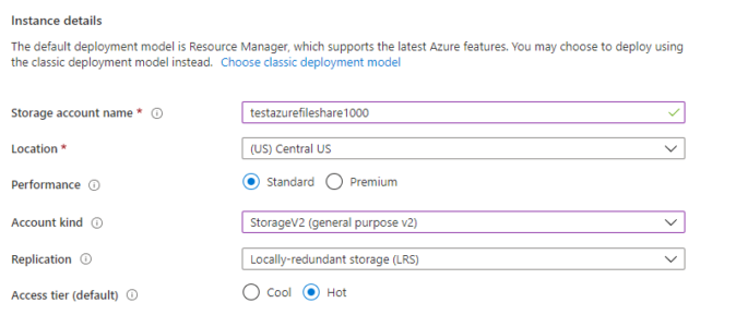
If you haven’t already created an Azure File Share, you can simply choose the Storage account – blob, file, table, queue resource type and choose StorageV2, if Standard, or FileStorage for better performance (at a higher cost), if using Premium. All other settings can be left as their defaults to quickly get started.

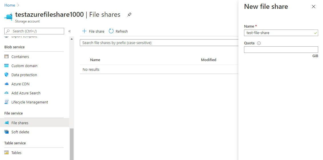
After the Storage Account has been created, an Azure File Share needs to be provisioned. Navigate to your newly created Storage Account and locate the File shares menu item. Click on the plus sign next to File share and create a new Azure File Share.

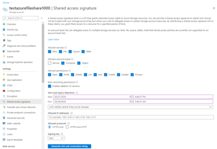
Finally, locate the Shared Access Signature (SAS) section. A SAS key is the only allowed authentication method for AzCopy and Azure File Shares at this time.

Copy the File service SAS URL for use with AzCopy. When using AzCopy, you will then append the SAS token to the end of the URL.

Common Operations

There are a couple of common scenarios that one might use AzCopy with and File Shares. Below are a few examples to illustrate how AzCopy works.

Copying Files

The simplest, but often most common, is that of copying files from a local system to an Azure File Share.

azcopy copy “D:\\WorkingFolder\\AzureFileShareTest\\testfile1.txt” “<https://testazurefileshare1000.file.core.windows.net/test-file-share?sv=2019-10-10&ss=bfqt&srt=co&sp=rwdlacupx&se=2020-05-28T07:40:37Z&st=2020-05-27T23:40:37Z&spr=https&sig=iReUp8%2BxMRVWl1Iv1Wtpu5Xcsj16tETLmpasoRLpHhs%3D>”

As you can see, this command transferred a single small file. All that was required is the SAS URL and the test-file-share container previously created as an Azure File Share.

To confirm that the file was uploaded, you can navigate to the File Share itself within the Azure Portal and on the Overview page, see the files that were uploaded.

To recursively upload a series of files, all that is required is adding the –recursive=true parameter to the existing command that was just run and leaving off the explicitly defined file.

azcopy copy “D:\\WorkingFolder\\AzureFileShareTest\\*” “<https://testazurefileshare1000.file.core.windows.net/test-file-share?sv=2019-10-10&ss=bfqt&srt=co&sp=rwdlacupx&se=2020-05-28T07:40:37Z&st=2020-05-27T23:40:37Z&spr=https&sig=iReUp8%2BxMRVWl1Iv1Wtpu5Xcsj16tETLmpasoRLpHhs%3D>” –recursive=true

If you do not specify \\* at the end of the local file, and only leave the trailing slash, then the entire folder and it’s contents will be uploaded. This may not be intended if you do not want to create the folder on the remote file share as well.

Listing Files

To show all files, simply use the list command. In this example, we are appending the –running-tally command which will also show a summary of the number of files and their sizes.

azcopy list “<https://testazurefileshare1000.file.core.windows.net/test-file-share?sv=2019-10-10&ss=bfqt&srt=co&sp=rwdlacupx&se=2020-05-28T07:40:37Z&st=2020-05-27T23:40:37Z&spr=https&sig=iReUp8%2BxMRVWl1Iv1Wtpu5Xcsj16tETLmpasoRLpHhs%3D>” –running-tally

Removing Files

Now that we have uploaded a number of files, perhaps we don’t need them anymore and should remove all of the one’s that we have uploaded.

azcopy remove “<https://testazurefileshare1000.file.core.windows.net/test-file-share/*?sv=2019-10-10&ss=bfqt&srt=co&sp=rwdlacupx&se=2020-05-28T07:40:37Z&st=2020-05-27T23:40:37Z&spr=https&sig=iReUp8%2BxMRVWl1Iv1Wtpu5Xcsj16tETLmpasoRLpHhs%3D>” –recursive=true

Note that we are only passing in the SAS URL, with the /test-file-share/* pattern to remove all files.

Conclusion

AzCopy makes transferring files to an Azure File Share easy and reliable. With a multitude of options, most scenarios that a system administrator would need to support Azure File Shares will be supported. As this tool is regularly updated, new capabilities and features are being added all the time. Easy to integrate into scripting environments, such as PowerShell, AzCopy will quickly become indispensable to any Azure File Share deployment.

About the Author: simonc

5 Creative Types of B2B Interactive Content

Keeping the attention of your audience has been the primary challenge of marketing since its beginning. In today’s shifting landscape in which more users rely on their mobile devices for digital activity, businesses need to employ effective strategies to keep pace. Many marketers have turned to B2B interactive content to give them the edge they need to stand out in saturated markets.

The ability to engage customers is what drives the current growth in b2b interactive content. From quirky quizzes to ebooks tailored to individual users, interactive content is helping businesses achieve their goals.

Why is B2B Interactive Content Valuable?

Not sold on b2b interactive content yet? Well, consider the following compelling reasons to feature some in your next marketing campaign.

#1. Engages Customers

People’s attention spans are short. Using content that centers on the user and packed with visuals stands a much greater chance of forming a connection than expecting them to read a lot of boring text.

87% of marketers felt that interactive content was more effective at grabbing the attention of the audience compared to static content.

B2b interactive content grabs the attention of clients and encourages them to return to your content and website. So what’s not to like?

About the Author: simonc