Author: simonc

Are Cheap Articles Worth Buying For My Website?

As the saying goes, you get what you pay for. Cheap articles are often cheaper for a reason. Most commonly, this reason is that they are poorly written or straight out of an article spinner. If you are only buying the articles to quickly fill a website and please the popular search engines, then bad grammar probably isn’t going to be much of an issue. If you are, however, looking for cheap articles for your visitors to read, but would like them to return to your website again in the future, be sure that your purchased articles, especially the cheaper ones, are of good enough quality to satisfy the people that visit your website.

If you have decided to buy cheap articles for your website, there are a couple of options for you to consider. Are you looking exclusively for original content or would cheap reprint articles be good enough? Typically, the more “original” the content is, the more it’s going to cost for you to buy. Be careful when buying cheap content that has been labeled “unique” or “full rights”, because more often than not, the content isn’t actually unique, despite it being labeled as such.

To make sure an article is indeed unique, perform a quick search in Google. Be sure to search for a short, but not too common phrase of around eight to ten words, surrounded by quotation marks. This should pull up all instances of the article if it has been previously published on the Internet. If matches are found, then you know the article isn’t as “unique” as promised. Steer clear of sites that promise unique articles, but don’t deliver.

If you are okay with buying cheap reprint articles, then it’s not always necessary to do a “uniqueness” search in Google. It can be a good idea, however, to perform a quick Google search if you are planning to publish the article on your website. If the article already appears on dozens of other websites, you might want to purchase a different article instead because it will be much harder to get a high search engine ranking with such a popular article.

Sometimes, however, reprint articles are purchased to be used in offline publications or newsletters and never end up being published online at all. Because these articles aren’t found in the Google Index, you will still be considered the premier publisher and receive all of the benefits that come with publishing an article first.

Another thing you’ll want to do, regardless of if you are buying unique or reprint articles, is to make sure that you know exactly what you are buying, before making your purchase. After all, if you can’t read the article, how do you know about the written contents or quality of the piece?

To solve this problem, make sure you are purchasing your cheap articles from a source that provides a large enough sample for each written article. So long as you can read a good portion of it, you will be able to better judge whether or not the article is of decent enough quality. A summary or partial preview isn’t always adequate for judging the scope of an article, so it is always best to read a full article preview whenever possible before making your purchase.

Depending on your individual needs, you may require changing the article before publishing it on your website. If this is the case, be sure that your content provider allows buyers to edit purchased articles. Remember, many content providers are strict about adding links or removing author bylines with certain license types, so be sure that you are buying from a website that gives you the option to change any purchased content if needed.

Finally, you should only purchase your cheap articles from a trustworthy site. Though this sounds pretty obvious, it can be difficult to determine whether or not a site is trustworthy. Look for signs that the website is well established and utilized by other buyers. Does the website look professional? Do they offer a secure shopping environment? Answering these questions can help you decide if the content provider is right for you.

If you are unsure about a particular cheap article website, but would still like to give them a try, it is always best to err on the side of caution. To test the trustworthiness of a site, complete a small purchase. This way, you can get a good sense of whether or not you’d like to continue dealing with the article provider, without having to worry about losing a large sum of money. You can always purchase more articles later, but by making your first purchase a small one, you will limit your losses should the company turn out to be a less than reputable source.

Buying content for your website can get very expensive very fast. Because of this, many website owners are looking for places to buy cheap articles. Buying cheap articles can be a great way to save money, but it can also lead to you getting seriously ripped off if you aren’t careful. Be sure that you know exactly what you are buying and from whom you are buying it, always check the uniqueness of the articles when purchasing full rights, and only buy from reputable content providers that offer substantial article previews. Following this simple advice will help to ensure that your cheap article buying experience is a pleasant one.

About the Author: simonc

Using Paid To Click Websites for Online Branding

For many new business owners, an important part of advertising a company is online branding. There are many ways to get your name out there online, but one of the most underused methods is utilizing paid to click (PTC) websites. Though PTC websites aren’t a good fit for all business models, they can be a valuable asset in certain cases.

Paid to click websites are a great place to advertise, especially if your target demographic is lower income individuals. Though paid to click programs have the potential to bring your company’s website a phenomenal amount of web traffic for very little money, there is one drawback. The reality of PTC sites is that they end up drawing a lot of lower income traffic – mostly people who are trying to earn a little money online – which is why they aren’t the best place to advertise high end products or services.

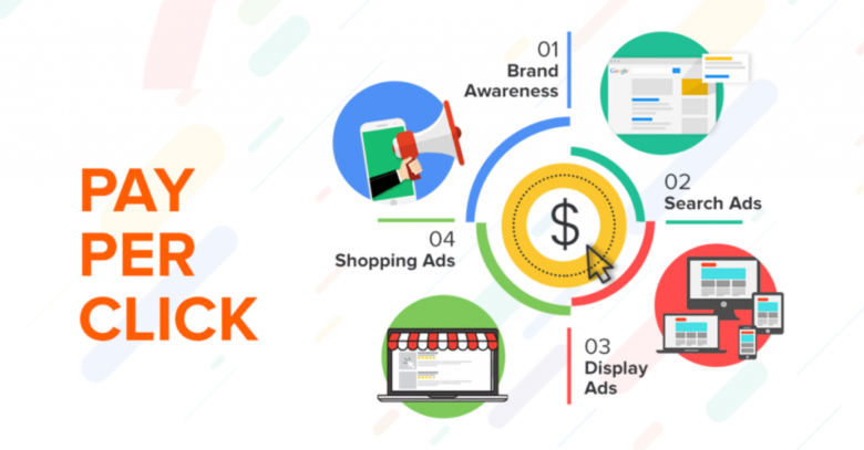
For a better understanding, it can be helpful to know a little bit about how these PTC websites operate. Advertisers pay a small fee to promote their website using a banner ad or text link which is then made available for members to click. If members choose to click a link, they are given a small amount of money in exchange for looking at the advertiser’s website. Every time a member clicks on one of your links, your company’s brand receives a little more exposure.

It is also worth noting that paid to click traffic tends to convert rather poorly. If your goal is sales, then you most likely won’t sell enough through PTC advertising to cover your initial investment, but you might end up with a small number of sales, sign ups, or subscriptions which can help offset advertising costs. Just remember, you aren’t advertising on PTC websites to make a sale. You are advertising to increase your company’s brand exposure.

Online branding is a vitally important part of any new business owner’s start-up plan. Though there are many ways to create brand exposure online, using paid to click websites can be a cheap and effective method, especially if you’re targeting a lower income demographic. With just a small advertising budget, any company can easily increase brand exposure by using PTC websites.

About the Author: simonc

Repurposing Old Blog Posts for Your Newsletter

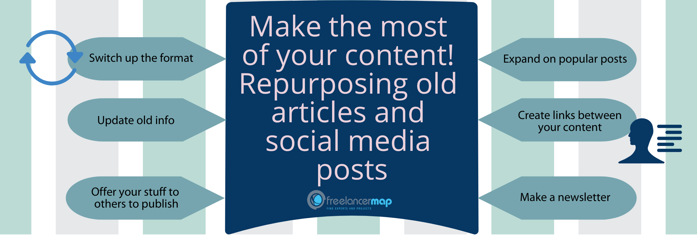
Do you run a newsletter but can’t seem to find enough useful information to keep it interesting for your readers? Or maybe its time for you to release your next newsletter, but you’re simply too busy to write the content for it. No matter which situation has you unable to keep up with your newsletter’s content demands, you should definitely consider repurposing your old blog posts into relevant content for your newsletter.

Your blog’s archives are filled with informative content that is interesting to your newsletter subscribers. If it wasn’t, then odds are your visitors never would have subscribed to your newsletter in the first place. Not only that, but your blog is probably full of old posts that your newsletter subscribers would still find quite interesting. Finding and repurposing some of these older posts can save a lot of time and effort when putting together future newsletters.

Now you may be asking yourself about whether you should distribute a newsletter containing “old” content. Think about it this way – the older the post, the less likely it will be that many of your newsletter subscribers have actually read it. As for the subscribers who have read the particular blog post that you will be repurposing, most will have probably long since forgotten the subject matter and would likely appreciate a second look at the topic.

Whenever you do choose to repurpose an old blog post, be sure to take some time and tweak any areas in the text that have become outdated. If the post references an event that was current during the post’s original release, then try to find a similar, but more recent reference to swap it out with. By tweaking the old blog post, it will once again be relevant for today’s audience, making it appear fresh and new instead of out of date.

If you find yourself struggling to put together a newsletter, either due to a lack of inspiration or available time, then you should definitely consider repurposing an old blog post. After a period of time, most blog posts end up forgotten by your long time readers and unread by those who are new to your site. Why not give these posts a second chance at life by using them in your site’s future newsletters?

About the Author: simonc

WYSIWYG Editors: Designing Websites Without the Coding Headache

WYSIWYG, which stands for “what you see is what you get”, is an acronym used to describe certain computer applications used when designing print media or web pages. In the case of website design, WYSIWYG editors are multi-beneficial. Not only will they help you to prevent a coding headache, but they can also help you to design websites without ever having to learn how to code in the first place.

Though often imperfect and occasionally limited in what they are able to do, WYSIWYG editors are a viable option for those who wish to make a website with little to no coding experience. Because WYSIWYG editors focus entirely on the visual aspect of designing, you can create a website without the need to code anything by hand. In fact, you won’t even need to understand why or how it works.

There are a number of applications that provide a WYSIWYG experience for creating websites. The most popular and well-known of these is arguably Adobe Dreamweaver. Though Dreamweaver allows the user to work from the Code View, Design View, or a Split View, entire websites can and are created in the WYSIWYG style Design View.

Obviously some WYSWYG editors are more intuitive than others, and as such, some will require more time for you to become fully familiar with the interface. This initial period of learning, however, tends to be shorter than actually learning to code websites by hand. This makes WYSIWYG editors a popular choice for those who are on a tight schedule or haven’t taken the time to learn the necessary coding languages to create the website they desire.

A word of caution however – most WYSIWYG editors are unable to create clean code behind the scenes. Because of this, it is common for websites created using a WYSIWYG editor to load slower than websites that were coded by hand. WYSIWYG editor created websites also have a tendency to appear different in different browsers and though not always an issue, is something that you should at least be aware of.

Because WYSIWYG editors allow you to work in a ‘what you see is what you get’ environment, anyone can design a website regardless of if they know how to code by hand or not. So long as you have access to a WYSIWYG editor like Adobe Dreamweaver, you will be able to create a website without ever having to learn or understand any coding languages.

About the Author: simonc

Increase Your Adsense Earnings by Choosing Top Performing Ad Sizes

If you’re hoping to increase your website’s revenue by tweaking your Adsense ad units, then you’ve probably thought about testing the various ad sizes to see which ones will work best on your website. That said, with so many ad sizes to choose from – 18 in all, not including the regional ad sizes – it can be hard to know where to start. So, how can a publisher effectively narrow down such a large number of ad sizes to be left with a more manageable selection?

Well, one way to narrow down the large selection is by prioritizing the ad sizes that are considered top performers by Google. Thankfully, it’s easy to find Adsense’s top performing ad sizes. Simply read through the Adsense Guide to Ad Sizes, found at https://support.google.com/adsense/answer/6002621, and pay special attention to the information that states which ad sizes are considered top performers and which are not.

According to Google, the top performing ad sizes are the 300×250 medium rectangle, the 336×280 large rectangle, the 728×90 leaderboard, the 300×600 half page, and the 320×100 large mobile banner. Please note that from this list, only the medium rectangle and the large mobile banner are currently formatted for use on high-end mobile devices. Also note that while the medium rectangle is formatted for all types of screens including mobile devices, the large mobile banner is aimed solely at mobile devices.

If instead of choosing a specific ad size you’d rather let Google dynamically decide which size of ad to display on your site, then consider using a responsive ad in your design. For this option, simply select the “Responsive” ad type when creating an ad. Though not officially listed as one of Adsense’s top performing ad sizes, responsive ads tend to perform well because they automatically adapt to most screen sizes. While responsive ads are intended to be used on responsive websites, it’s worth noting that they can also be used without issue on non-responsive sites.

Though the Adsense Guide to Ad Sizes provides a wealth of valuable information, its important to remember that it contains sweeping generalizations which may not be true for all websites. Because of this, the most complete results tailored to your particular website can only be obtained by testing every available ad size on your actual website. For those of you who don’t have the time or patience to test them all, consider displaying a responsive ad or an ad with dimensions matching one of Google’s top performing ad sizes. By following this simple suggestion, it’s entirely possible that you’ll increase your overall Adsense earnings.

About the Author: simonc

Web Design Mistakes – Animated GIFs

It can be tough for amateur webmasters to create a professional looking website. You want your visitors to take you and your product seriously, but what is the best way to go about it? For starters, think about whether or not your website should be displaying animated GIFs.

Animated GIFs are those little fun moving images that can be found all over the Internet. Sometimes they are used as banners, other times as icons, and yet other times as simple graphical images. No matter what they are being used for, the key to defining an animated GIF is two-fold – first that it moves and second that it has a .gif file extension.

Granted, a well-placed animated GIF can bring a certain flair to your website, but be careful not to add too many, because once you’ve crossed the line of too many moving, blinking, or spinning images, you’ve already started losing potential customers.

Most people cringe upon seeing pages bursting with movement. It’s annoying, distracting, and does nothing but draw your visitors’ eyes away from the very products or services you are promoting. In fact, many visitors will quickly exit out of a page, if they feel there are too many distracting animated GIFs.

Now, making your visitors feel negatively enough about your website that they want to exit out of it, isn’t the greatest way to convince your potential customers that you’re running a trustworthy and professional business. So, the next time you think about placing an animated GIF on your website, be sure to thoroughly weigh the pros and cons of the image, to better decide if you should or shouldn’t display it on your web page.

About the Author: simonc

Web Design Mistakes – Centered Text

After much debate, you’ve started your own website. You’ve decided on your colors and basic layout, but now what? It’s time to add content! As they say, content is king and they are definitely right. It is the most important part of every website. Your content is what search engines will feature in their index and what your visitors will be coming to read.

So, what is the best way to display your content? If you’ve just answered this question with the phrase, “centered on the page”, you may want to continue reading. You could be in for a surprise.

It’s true, many new web designers center all or much of their content. In fact, this is one of the design flaws that separate beginner web designers from the professionals. Having a predominantly centered web page is a dead give-away that an amateur designer has created the website.

You might be asking yourself, “but why is centered text that big of an issue?” The answer is simple. It goes against our natural way of reading. Since childhood, we are taught to read from left to right, on pages that are left-aligned. Changing this format, even a little, won’t affect how search engines view your pages, but it can make your content more difficult to read for your actual visitors.

So, the next time you want to center-align the majority of your page’s content, remember that not only will you come across as a beginner web designer, but it will also make your content harder to read for your visitors. Making your content as easy to read as possible will please your visitors and help to encourage them to return to your website in the future.

About the Author: simonc

Adsense or Amazon: Which Will Help You to Earn Money Online?

There are two major players when it comes to earning money online, Google Adsense and Amazon Associates. Is one of these programs a better way to earn money than the other or is a combination of the two best for your website? Read on to find out.

To start off, we will take a closer look at each program.

Google Adsense

The Google Adsense program is arguably the most well-known way to earn money online. Though entrance into the program isn’t always the easiest thing to obtain, once accepted, you will be free to add their advertisements to any of your websites that meet the requirements.

Adsense is mostly used for adding textual or image-based ads to a website, but there are several other departments you may wish to look into like Adsense for search, games, mobile content, and video. Generally, Adsense advertisements are paid for on a cost-per-click basis, but there are also advertisers who pay using a cost-per-impression system.

About the Author: simonc

Can You Really Make Money on PTC Websites?

If you have searched for ways to make money online, you’ve probably come across paid to click (PTC) websites. Sure, it looks easy enough to make some money by simply clicking on some links, but unfortunately it isn’t always as easy as it sounds. So, can you make money on paid to click websites? Yes, but you’ll have to join the right programs and put forth a little effort to maximize your chances of success.

The key to making money on a PTC website is finding a site with a low minimum payment threshold that also has the potential for referrals. By finding a site that works in both of these regards, you will have the best chance at making some real money.

About the Author: simonc