Author: simonc

What is the Difference Between WordPress.com and WordPress.org?

Despite WordPress being one of today’s most popular blogging options, many people remain confused about the differences between WordPress.com and WordPress.org. Though both websites may sound similar at first mention, there are several important differences between the two. So, if you are planning on creating a WordPress site, be sure to compare the differences between WordPress.com and WordPress.org, so you can choose the product that is right for you.

The following lists wilt help you compare the two sites:

WordPress.com

On WordPress.com, blogs are hosted by WordPress, so you aren’t required to purchase a custom domain name or web hosting. There is also no need to download or install the WordPress software yourself.

When using WordPress.com, basic service is free but ad-supported. Free accounts have limited storage space and use a WordPress.com subdomain for the website address.

Upgraded accounts on WordPress.com have access to more features than their free counterparts. Popular upgrades include increased storage space, the ability to install plugins, and monetization options. While upgraded accounts are still hosted by WordPress, they can use a custom domain name if one is purchased separately.

When creating a site at WordPress.com, all updates, backups, and maintenance are performed by WordPress.
About the Author: simonc

Five Reasons to Buy an External Hard Drive

With file sizes always on the rise, you might be finding yourself with little to no space left on your hard drive. If this is the case, you are not alone. Many other people also suffer from this lack of space, forcing them to delete files or burn them to disk. If you find that your computer just never has enough space anymore, you may want to consider buying an external hard drive instead. Still unsure? Here are five reasons that may help you to decide.

External hard drives can provide a lot of free space.

With external hard drive sizes reaching into the terabyte range (1000 GB+), there’s plenty of storage options available. Even at just 1TB, that is often more storage than many newer computers are equipped with. Also, if past trends are any indication, the size of external hard drives will undoubtedly continue to rise.

External hard drives eliminate the need to delete files.

Instead of deleting the files that you wish to keep, an external hard drive will allow you to safely store your files for future use. Even if the external hard drive should eventually fill up, you can always increase your space by purchasing another.

External hard drives can save you time.

One of the best parts in owning an external hard drive is the time that it can save you. Instead of spending hours burning disks, just simply save your files to an external hard drive and you’re done. This eliminates the need to wait around for your DVD burner whenever you need to clear up some disk space.

External hard drives are more cost effective than disks.

Obviously the larger the external hard drive, the more money it is going to cost. But when you calculate the cost of writable disks, you’ll see that it’s actually cheaper to buy the external hard drive, than to buy the amounts of disks needed for the same amount of storage space. And it’s always getting cheaper, in fact, with the costs of external hard drives on the decline.

External hard drives take up less storage room than traditional disks.

With a standard writable DVD holding 4.7 GB of storage, you would need to buy over 200 DVDs to store the same amount of files that could be stored on a single 1 TB external hard drive. Even if you were to buy the dual-layer disks which hold 8.4 GBs of storage, over 100 DVDs would still be needed to match the storage space found on the one external hard drive.

If you, like many other people have found yourself with very limited disk space, it’s time to consider getting an external hard drive. Not only they can provide a ton of free disk space, but they also eliminate the need to delete files and can save you time, money, and storage space. So, what are you waiting for? Go and get yourself an external hard drive today!

About the Author: simonc

Using Bounce Rate Data to Help Improve Your Page Hits Per Visit

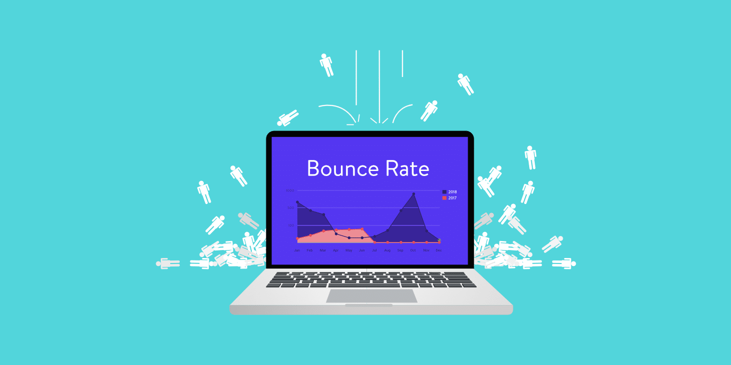
There are various ways to increase page hits per visit, but one of the easiest ways is to improve your poorly performing pages. By using bounce rate data from your visitor statistics, you will be able to identify your poorly performing pages, make the appropriate changes, and watch your site’s page hits per visit increase.

A web page’s bounce rate statistics reflect the number of visitors who leave your website on a given page. The higher the bounce rate is on a particular page, the more the page could benefit from being tweaked. By finding out which pages have the highest bounce rate, you will know exactly what you could be working on to improve your overall page hits per visit.

If you are unsure about what improvements you should be making to the pages, it can be worth it to compare your pages with the highest bounce rates to your pages with the lowest bounce rates. While comparing your poorest performing pages with your best performing pages, you might be able to spot some areas that could account for the difference in performance levels.

One thing in particular that you’ll want to look out for on your poorly performing pages is a lack of options. If your readers are not presented with links to additional information on your website, it is likely that you will see a high bounce rate for the page. To remedy this common problem, simply add some links to related content elsewhere on your site. Not only will this encourage further exploration of your website, but it should also help increase your site’s page hits per visit.

There are many reasons why you may want to increase your website’s page hits per visit. Regardless of your reasons, however, you’ll be pleased to know that your site’s bounce rate statistics can be used to help you locate which pages are in need of a little help. By recognizing which of your pages are performing poorly, you will be able to take action toward correcting the problem and enjoy the benefits and satisfaction that comes from receiving more page hits per visit.

About the Author: simonc

Three Common Errors All Webmasters Should Avoid

When creating a website, it is important that your web pages are free from broken elements or missing content. Most often, broken or missing content occurs because of errors in the links, images, or HTML of the web page. By taking the extra time to avoid such problems, your website will appear more professional, encouraging repeat visitors. Below are three common website errors that all webmasters should avoid.

Broken Links

Clicking on a broken link is a frustrating experience for any website visitor. Be sure to check that each of your newly created links directs to the correct web page or resource, such as an image file or download.

If your web pages contain links to other websites, occasionally check that each offsite link is functioning correctly. This is important because the web page that you originally linked to may have been removed or changed since you first created the link.

There are resources online that can search for broken links within your website. Though these broken links finding resources can be a valuable tool for website maintenance, you should not rely solely on these services. It is still recommended that you hand click each link, as a link will not appear broken to these services so long as the linked page still exists – even if the linked page has been significantly altered since you last linked to it.

Missing Images

Web pages with missing images look unprofessional to website visitors. Whenever adding a new image to your website, use a web browser to ensure that it is displaying correctly.

If for some reason your image is not appearing in the correct manner, make sure that the image has been uploaded to the correct location on your server. If this isn’t the problem, verify that the filename is spelled correctly in your HTML code and that the correct file extension (.jpg, .gif, etc.) is included.

Also, not all image file extensions are compatible with all Internet browsers, so it is best to stick with the most widely supported file types. An image saved in an unsupported file type may appear as a broken or missing image.

Breakthrough HTML

It can be confusing for your visitors if parts of your HTML appears on the web page instead of your content. This often happens when there are errors in the HTML code itself. If you spot this problem on one of your web pages, double-check to see that your tags and end tags are present and spelled correctly.

To help find errors in your HTML code, it can sometimes be faster to use one of the many free online HTML validation services. The validation service will give you a list of errors within your HTML that could be causing the problem. Fixing these errors will rectify most problems, including breakthrough HTML.

By taking the extra time to stop broken links, images, and HTML from appearing on your web pages, your website will look more professional to your visitors. This will leave your visitors with a better impression of your website while making it more likely that they will return to your website in the future.

About the Author: simonc

Small Business Owner? Let a Professional Design Your Website

Money can be tight when you own your own business, which is why many small business owners end up creating their own business websites. Though this decision may seem like a good way to save money, it could actually cost you more in the long run – something no small business owner can afford.

For starters, professionally built websites are often more visually appealing. Websites built by amateurs may not appear correctly in all browsers and they are likely to be created with poorly written code, both of which can be detrimental to your business. Poorly written code can lead to slower loading web pages, or worse, pages that don’t function properly in all browsers.

In the same way that a poorly-created site can drive traffic away from your business, a better-looking and properly functioning website will instill trust in your potential customers. This can lead to more sales, which in turn, can put more money into your bank account.

Hiring a professional can also get your business online faster. This is because a professional web designer already knows how to design and code websites. It’s what they do on a daily basis, so they can do it much more quickly than someone with no prior knowledge of coding or design. A professionally designed website will be accessible to the public earlier, giving your company that extra boost in exposure sooner than would have otherwise been possible.

Just be sure to shop around and request a few quotes before deciding on which company to work with. If you already know of someone who has a professional looking website, ask them who designed it, what their opinion of the company is, and whether or not they would recommend that company to you. Consider this information carefully when making your decision.

So, if you are a small business owner who’s been thinking about saving a few dollars by creating your own website, think again. By spending some money upfront to have a professional design and build your website, you will end up saving both time and money in the long run.

About the Author: simonc

Never Discount the Importance of Testing Your Website’s Links

Links are an essential part of any website. After all, they form the basis of all online navigation. That’s why regardless of if you are directing your visitors toward another page of your site or sending them to a different site altogether, your links need to work. Otherwise, your visitors may become frustrated with your site and never return. To prevent such frustration, all new links should be immediately tested as you add them to your website to ensure correct functionality. Time allowing, you should also occasionally test any previously added links to offsite pages, because such pages can be changed or removed at any time, often without warning.

So, how can you check that your website’s links are indeed functioning correctly? Well, the most basic way of testing a link is simply clicking on it and seeing what happens. If the link redirects you to the correct page or resource, then great – no further action is necessary! If the link isn’t directing you to the correct page or resource, however, then you’ll need to take a closer look at the link itself and correct any errors that may be preventing it from working as expected. Also, if a linked page or resource is no longer available, then you’ll need to remove its corresponding link from your site or find a suitable replacement link to use instead.

Now, this basic method for checking link function obviously works well on small sites, but as it requires you to manually check each link, it can prove to be very time consuming on larger sites -especially sites containing hundreds, thousands, or even millions of links. So, how do you go about testing the links on larger or link-heavy sites? One method many webmasters choose is tasking special link-checking software to do the work for them. Online resources are also available to help automate the process, with the W3C Link Checker being a popular choice. If you wish to give the W3C Link Checker a try, please visit

http://validator.w3.org/checklink.

Another way to seek out information about your website’s potentially broken links is to visit your website’s error log. If you have access to the log files, then you should be able to see a list of the latest errors encountered on your website. Typically, error logs include information about any pages or resources that were unreachable to visitors, plus information about the page or resource that generated each error. By using your website’s error log as a guide, you’ll have a better idea about which links may need to be fixed or removed.

Unfortunately, there’s a serious problem that occurs both when using automated link testers and when checking a website’s error log – neither method pays any attention to the actual content of the linked pages or resources. Links receive a passing grade so long as the page or resource that is being linked to simply exists. This can be a major problem if you often link to offsite pages or resources that you have no control over because any changes to such content may go unnoticed by you while your original link remains active to your visitors. To ensure that the linked destination still contains the same content it did when you first linked to it, be sure to occasionally check your links manually, especially if you are linking to pages or resources beyond your control.

Because links are such a crucial part of any website, it is critically important to test them regularly to ensure they are functioning correctly. Though automated link testers and error logs are informative and can help speed up the testing process when used, don’t forget that manual testing is also important – especially if you are linking to pages or resources that could change without your knowledge. By checking your error logs and regularly testing your website’s links both manually and via an automated link checker, you will have the best chance of locating your website’s problematic links allowing you to correct any problems that could prevent your visitors from easily navigating your site.

About the Author: simonc

Great Titles Bring in More Blog Visitors

If you are like most bloggers, you are probably looking for new ways to get more traffic to your blog. Although there are several ways to bring in more visitors, one of the most overlooked methods is to improve on your blog post titles. After all, the title is often the deciding factor for whether or not a person chooses to click through to your post.

When considering titles, remember less is more. Shorter titles are easier for people to scan, while longer titles often get cut short by the popular search engines. By keeping your titles reasonably short, you can ensure that they are fully visible each time your blog appears within a search engine’s results.

It can also be a good idea to do a little research as you are coming up with the specific wording for your titles. Using a resource like the Google Adwords Keyword Tool, you can type in some words relating to your post. This will give you a good idea about the search terms people are using for the topic you have written about. Including popular phrasing into your titles can entice more people to click on your link and open your blog.

Another important part of any great blog title is its ability to grab the reader’s attention. There are many phrases that can be used to gain attention, with some of the more popular choices being, “The Secret of…” and “Little Known Ways to…”. By adding attention grabbing words to your titles, more people will choose to click through the link and read your blog post.

While it is always a good idea to consider each new title carefully as you add content to your blog, it’s never too late to improve the titles of posts that have already been published. Any improved titles will be updated in the search engine results the next time your blog post is spidered.

Yes, it can be a little time consuming to come up with creative and attention grabbing blog titles, especially if you are going back and updating the titles of your old posts. It is worth the effort, however, because with these new and improved titles you are bound to see an increase in the number of people visiting your blog.

About the Author: simonc

Quick Blogging Tips: What Makes for Good Blog Content?

Before you sit down and start to write, it’s important to note that writing for a blog is different than writing for other mediums such as academia or the press. That being said, what type of content works well with blogs? Where academic papers and press releases lean toward the more formal side of the spectrum, blog content tends to be more informal and sometimes even personal in nature.

This does not mean that blog content should be badly written, however, because poorly thought out or grammatically incorrect posts can have a negative impact on your visitors. Blogs with well thought out and easy to read content tend to have more followers than ones that do not.

To increase your readership, you’ll want to write informative and engaging posts that will encourage your visitors to leave comments and share your blog with their family and friends. The more engaging your blog’s content is, the more people will hear about it. The more people who hear about your blog, the more traffic it will eventually get.

Now obviously blogs are very diverse in scope and overall objectives, so what works well on one blog may not necessarily work on the next. If you are unsure about how you want to go about writing for your blog, feel free to test out different writing styles or levels of formality and see what works best for you and your visitors.

About the Author: simonc

Creating User Friendly Website Navigation

An often overlooked part of website design involves the creation and placement of a website’s navigational links. If your links are badly placed, your visitors may become frustrated and leave your website before ever finding your navigation. If your links are badly labeled, your visitors may become hesitant to click leaving portions of your website unread. Luckily, there are many ways to make your website’s navigation more user friendly to your visitors. Below are four suggestions to get you started.

Choose the best location for your navigation.

As they say, location is everything. Be sure that your navigational links can be easily found by those who visit your website. Most visitors won’t search for hard to find navigation, so it is always best to display your links in an obvious location. This will help your visitors to better explore your website.

Common ways to display a website’s navigational links include horizontally across the top of the page or in a vertical column near the top right or top left. For websites with large scrollable web pages, the second set of links near the bottom of the page can also be helpful.

Use the same navigation location throughout your website.

Once you have chosen the best place to display your navigational links, it is important to maintain this position throughout the rest of your website. Frustration is a common response when visitors must seek out the changed location of a website’s navigation with each newly loaded page. Having a standard navigation location on each of your web pages will make browsing through your website much easier for both your new and returning visitors.

Label your navigation in an easily understood manner.

Whether you choose to use images, text, or a combination of the two within your website’s navigation, it is important to use graphics or labels that can be easily understood by your website’s visitors. There should be no confusion as to cohere any of the links in your navigation will lead.

Displaying poorly labeled links can be confusing for your visitors, which can ultimately lead to your visitors prematurely leaving your website. This can produce less page views per visit and even the loss of potential sales. For these reasons, webmasters should be extra cautious to avoid confusing labels when creating their website’s navigation.

Ensure that each link used in your navigation is working properly.

The final stage in the creation of a website’s navigation should always be testing that each link functions correctly. When clicked, do each of the links redirect to the proper page? Do the links appear correctly during each of the four links states – unvisited, hover, active, and visited? Testing that each individual link is working correctly can be a very time consuming task, but it is still an essential part of your website’s navigation creation.

Your website might contain some of the most useful and unique content on the Internet, but without properly created navigational links, your visitors may never find it. By taking the extra time to create more intuitive navigation, your visitors will enjoy a more user friendly experience while surfing through the pages of your website.

About the Author: simonc